

A brand guideline PDF whose numbers are measured from your own files.
The Style Guide is the document you hand to a colleague, an agency, a printer or a franchisee so they use your brand correctly without asking you first. What separates it from a template is where the numbers come from: they are measured, not written.
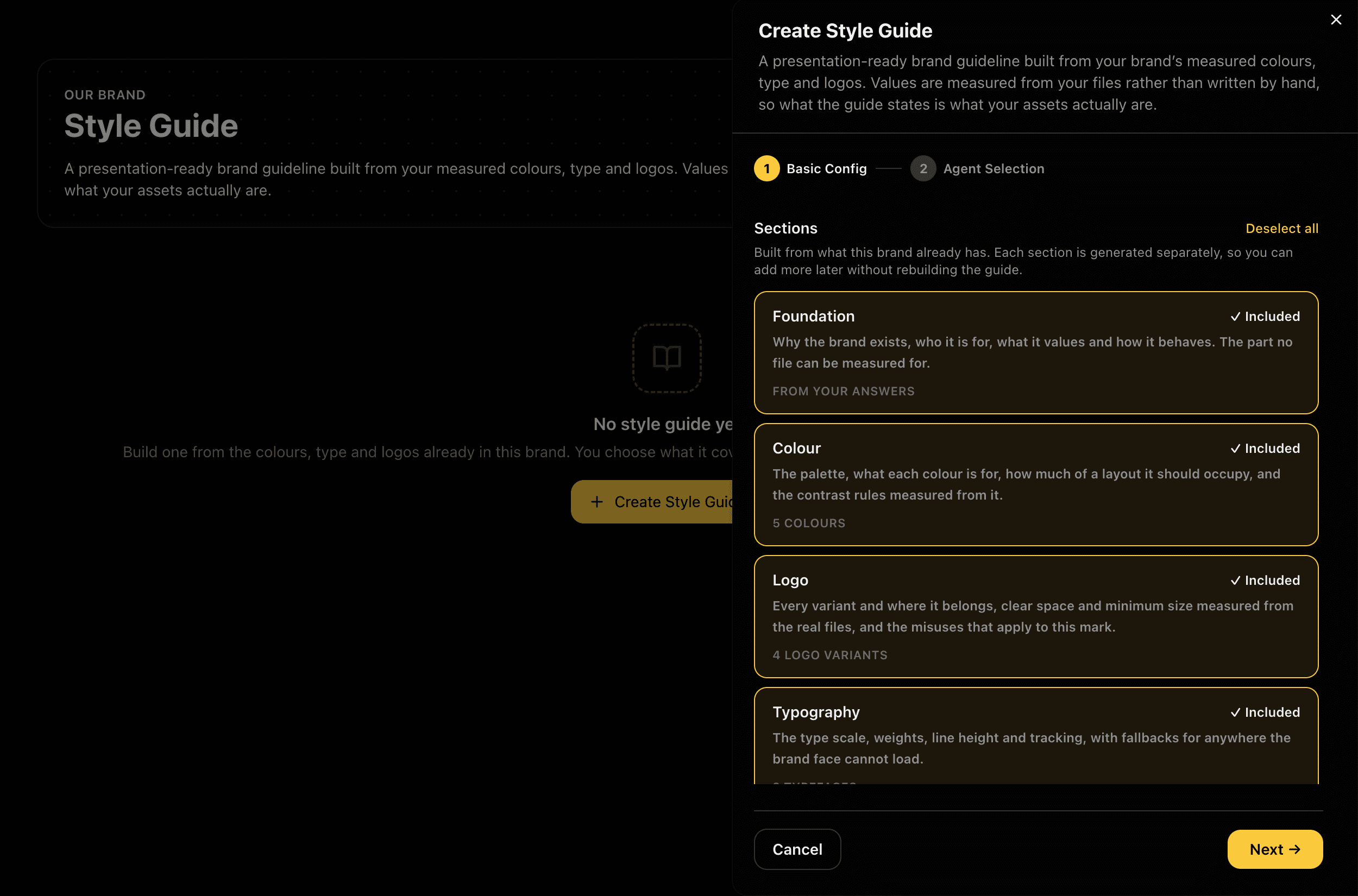
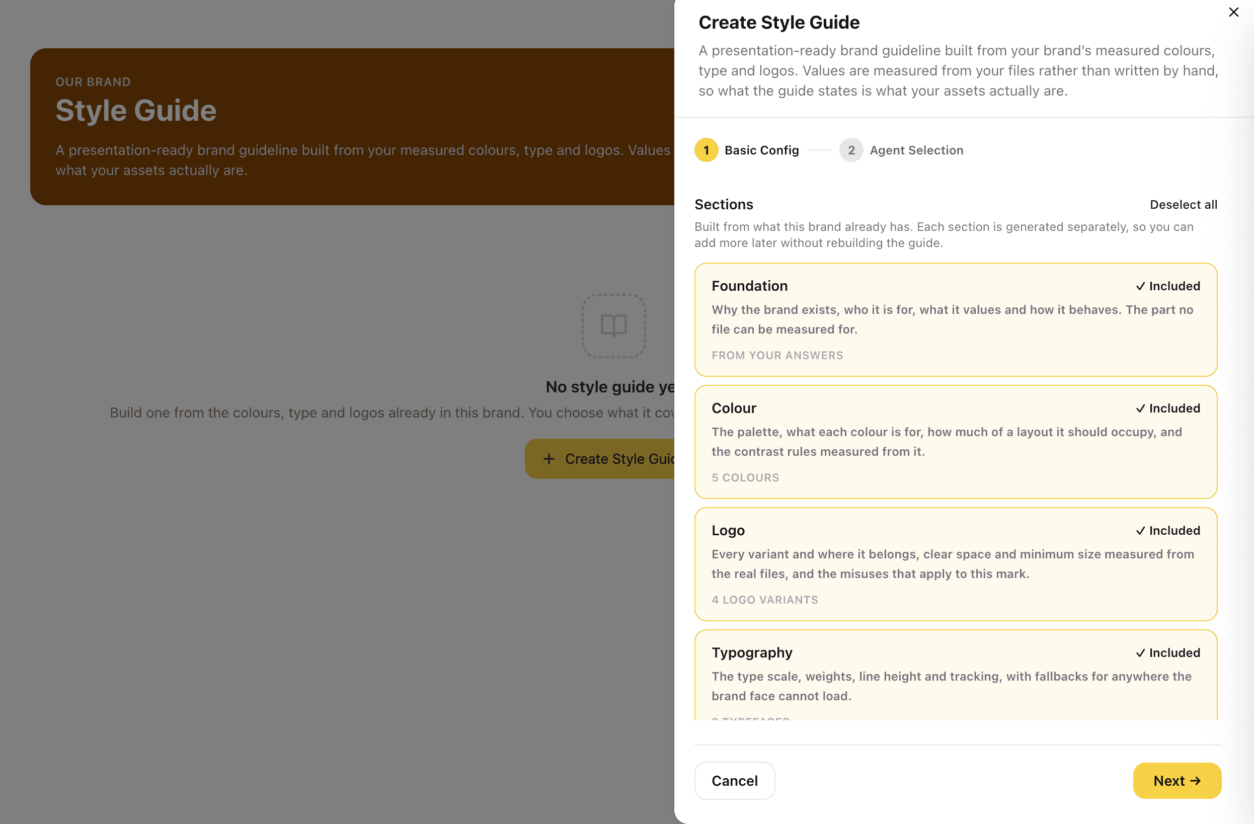
Choose Sections and One Writer
Name the guide and say who it is for. Add an optional Design Brief for direction the measurements cannot carry, such as how formal it should feel. Then pick the sections and one assistant to write it: a guide is one document with one voice, so one assistant writes every section. Creating costs nothing.
Sections are offered only when your brand has the material behind them, so you never ship a page with nothing real on it.
Captures
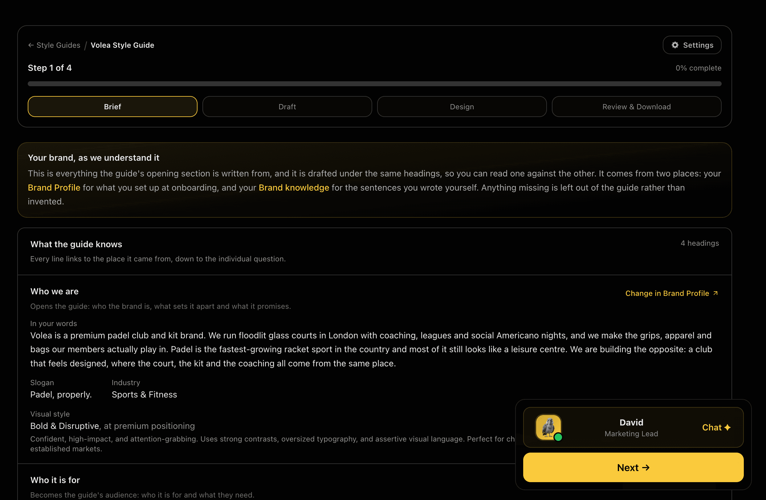
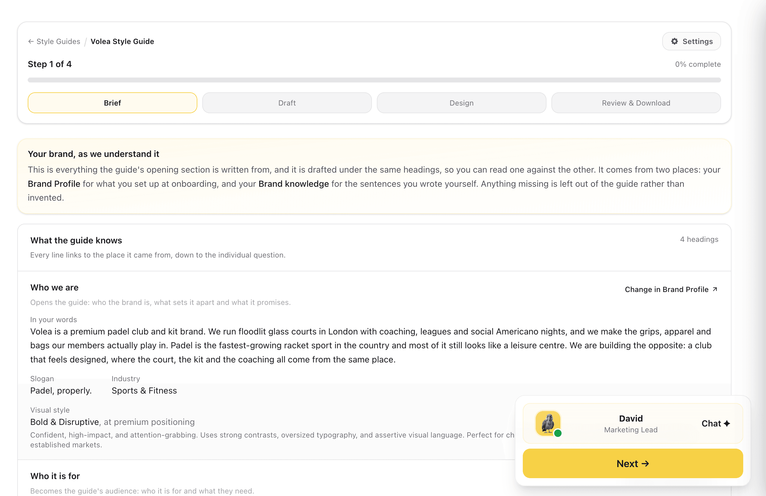
Brief: See Where Every Line Comes From
A read-only step that plays back everything the Foundation section will be written from, under four headings: Who we are, Who it is for, How it comes across, and Values. Every line names its source, linking straight back to the Brand Profile field or Brand knowledge answer it came from. Nothing is typed here. If a line is wrong, change it where it lives and the guide follows.
One source of truth. Correcting the brand corrects the guide, rather than creating a second version of the facts.
Captures
Draft the Wording, Free
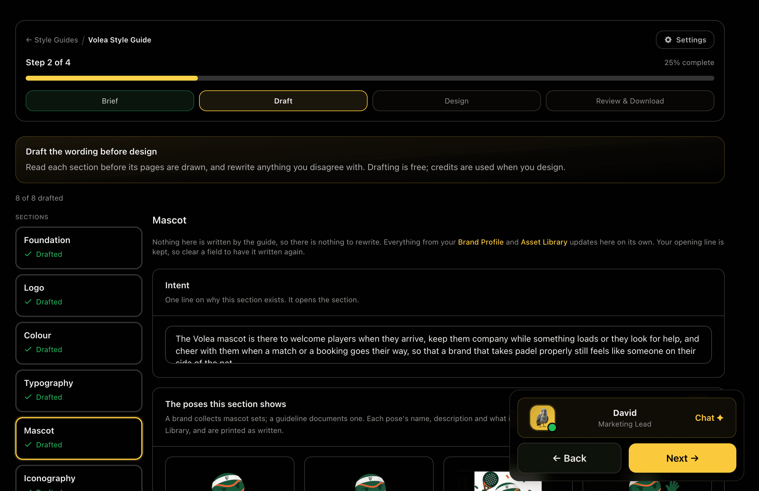
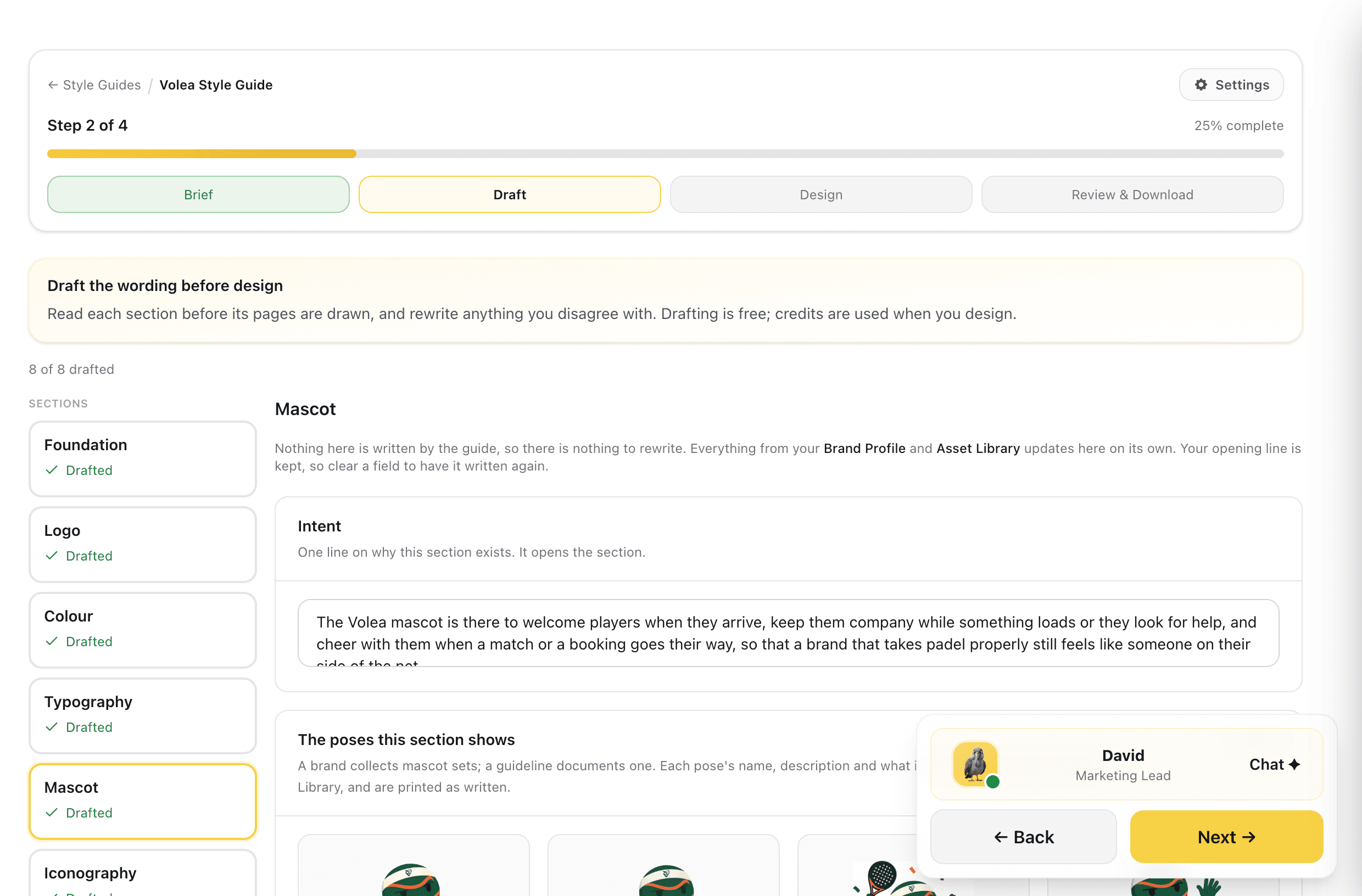
The assistant writes what each section will say and you read it before anything is designed. Edit the intent lines, the what-not-to-do lines and the misuse captions, or rewrite any section as often as you like, free. Measurements and brand information are shown but never typed here, because a typed value becomes a second source of truth that eventually disagrees with the file.
This is the step the whole flow exists for. Redoing a sentence is free; redrawing a page is not.
Captures
See What the Pages Will Be Built From
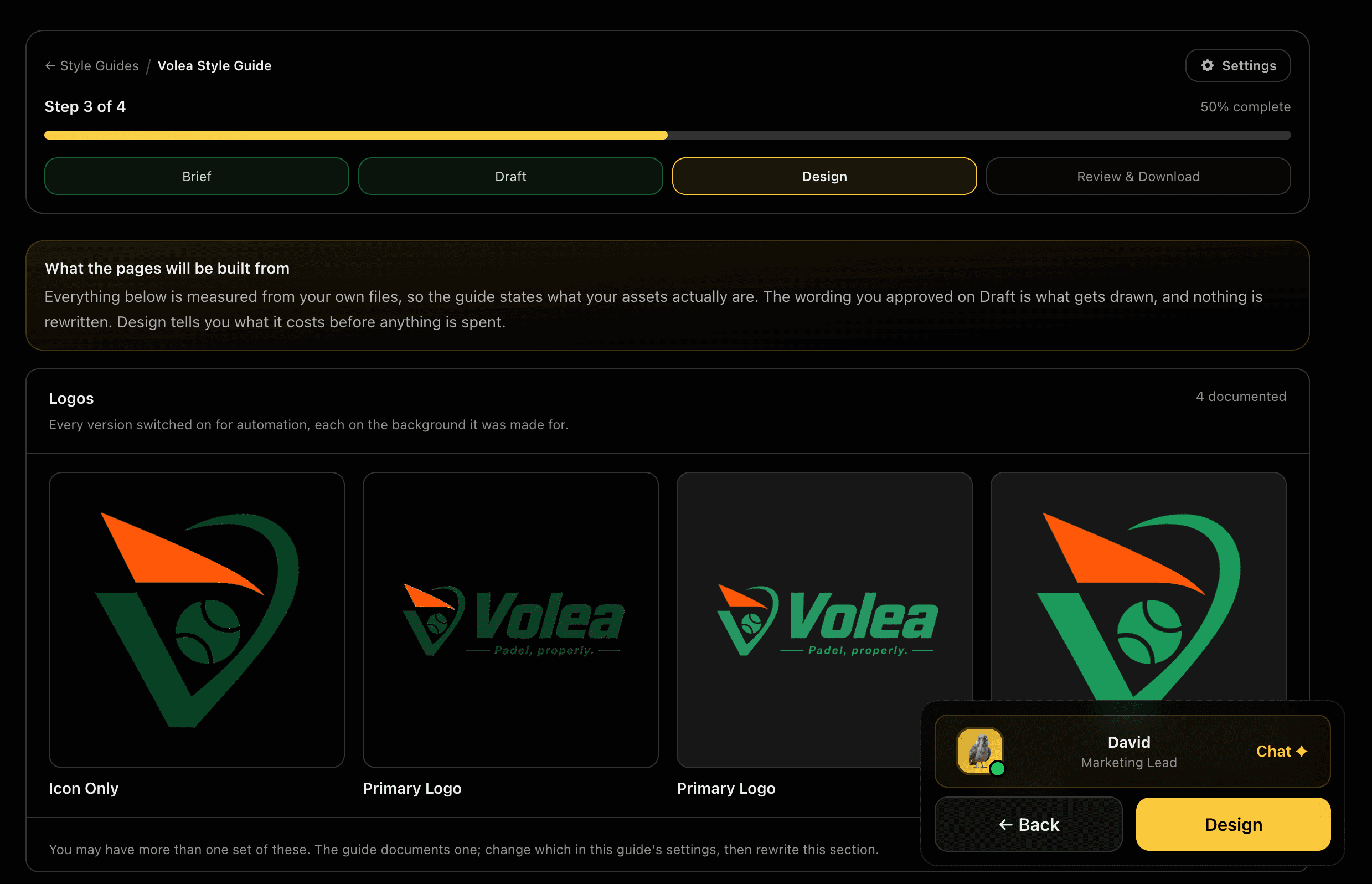
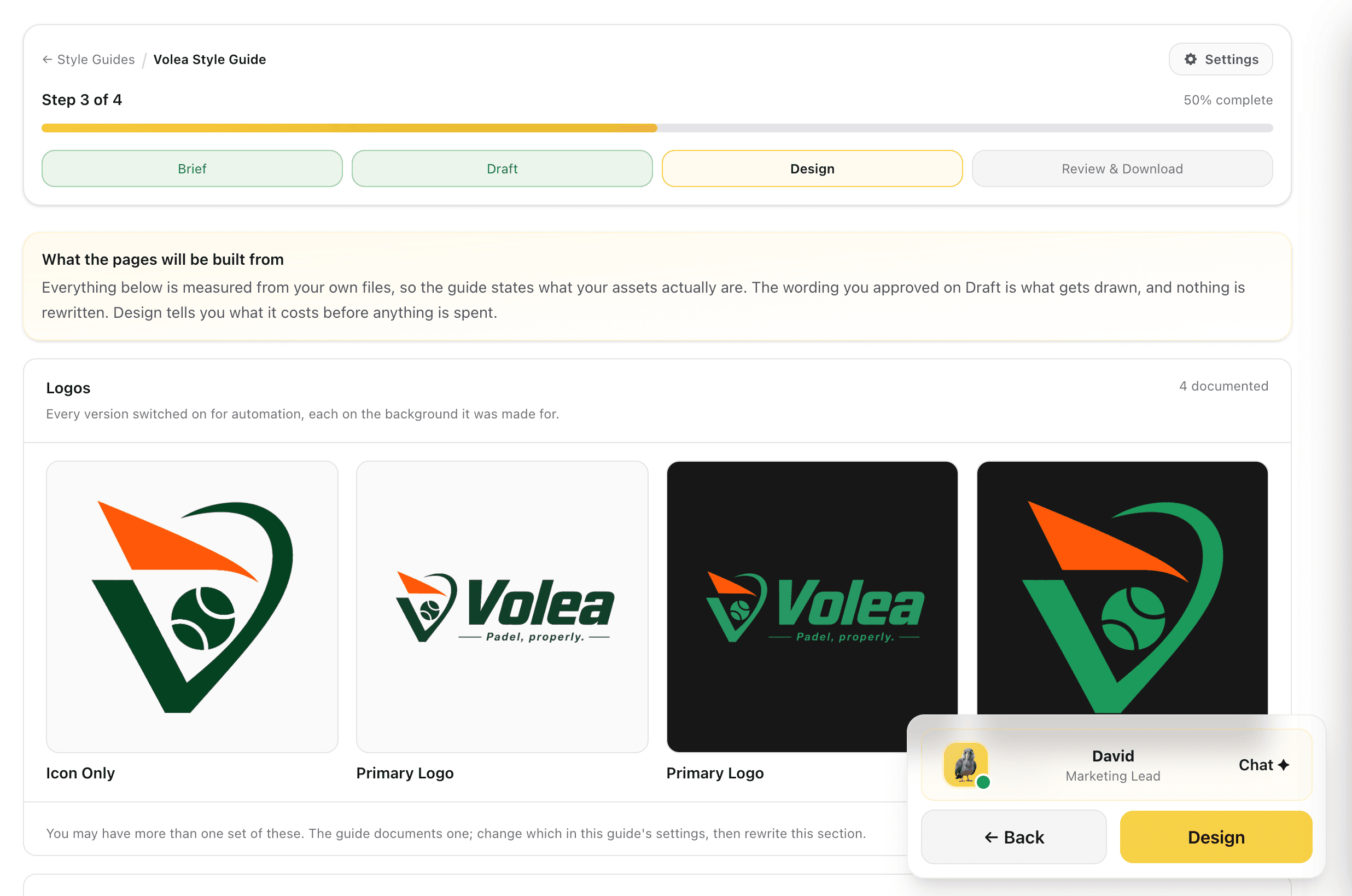
Before anything is drawn, Design shows you the raw material: every logo version switched on for automation, each one sitting on the background it was made for. The wording you approved on Draft is what gets drawn, and nothing is rewritten here. Design tells you what it costs before a credit is spent.
A guide that documents a logo you no longer use is worse than no guide. Seeing the real files first is what prevents it.
Captures
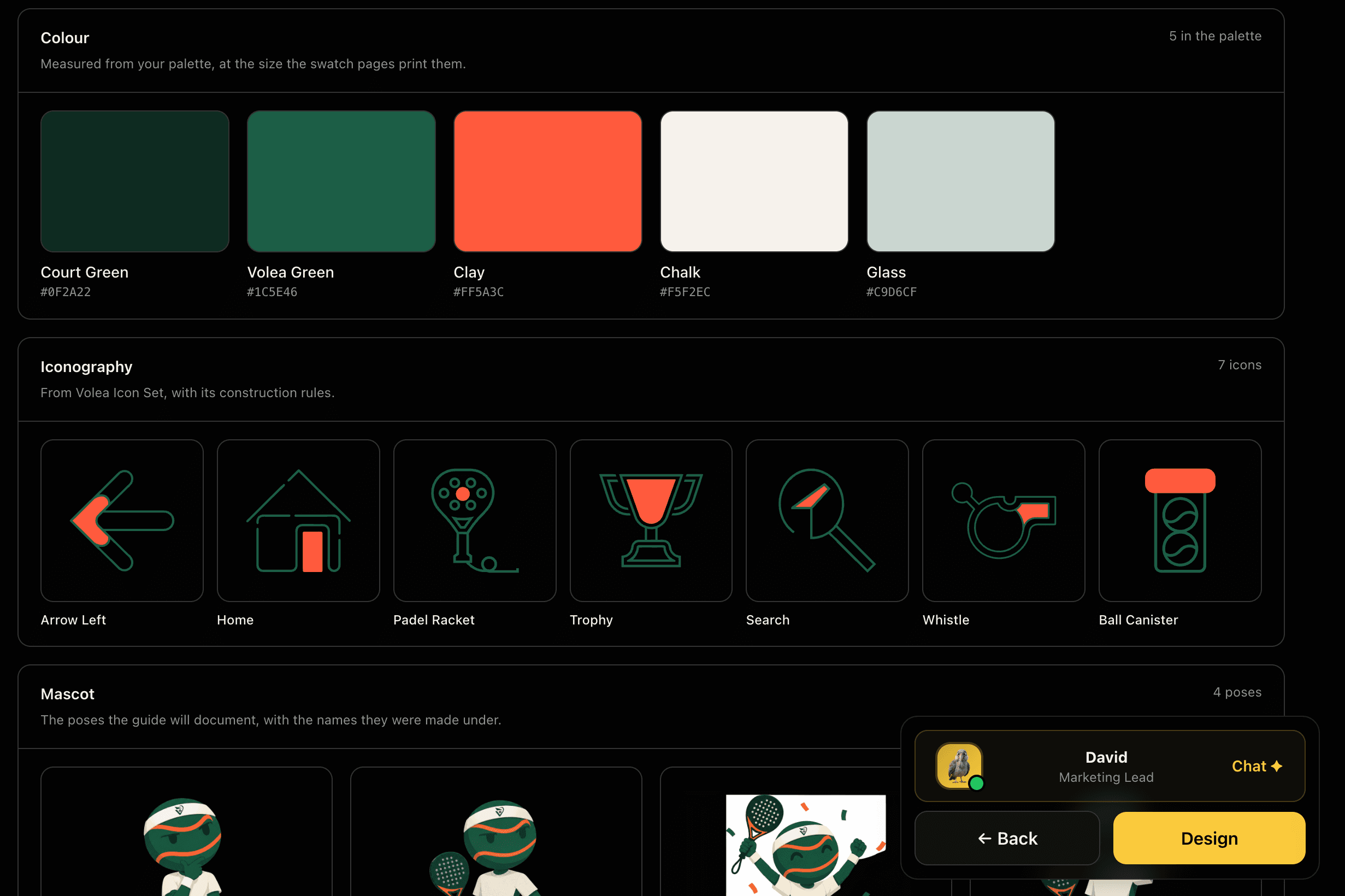
Colour, Icons and Mascot, Counted
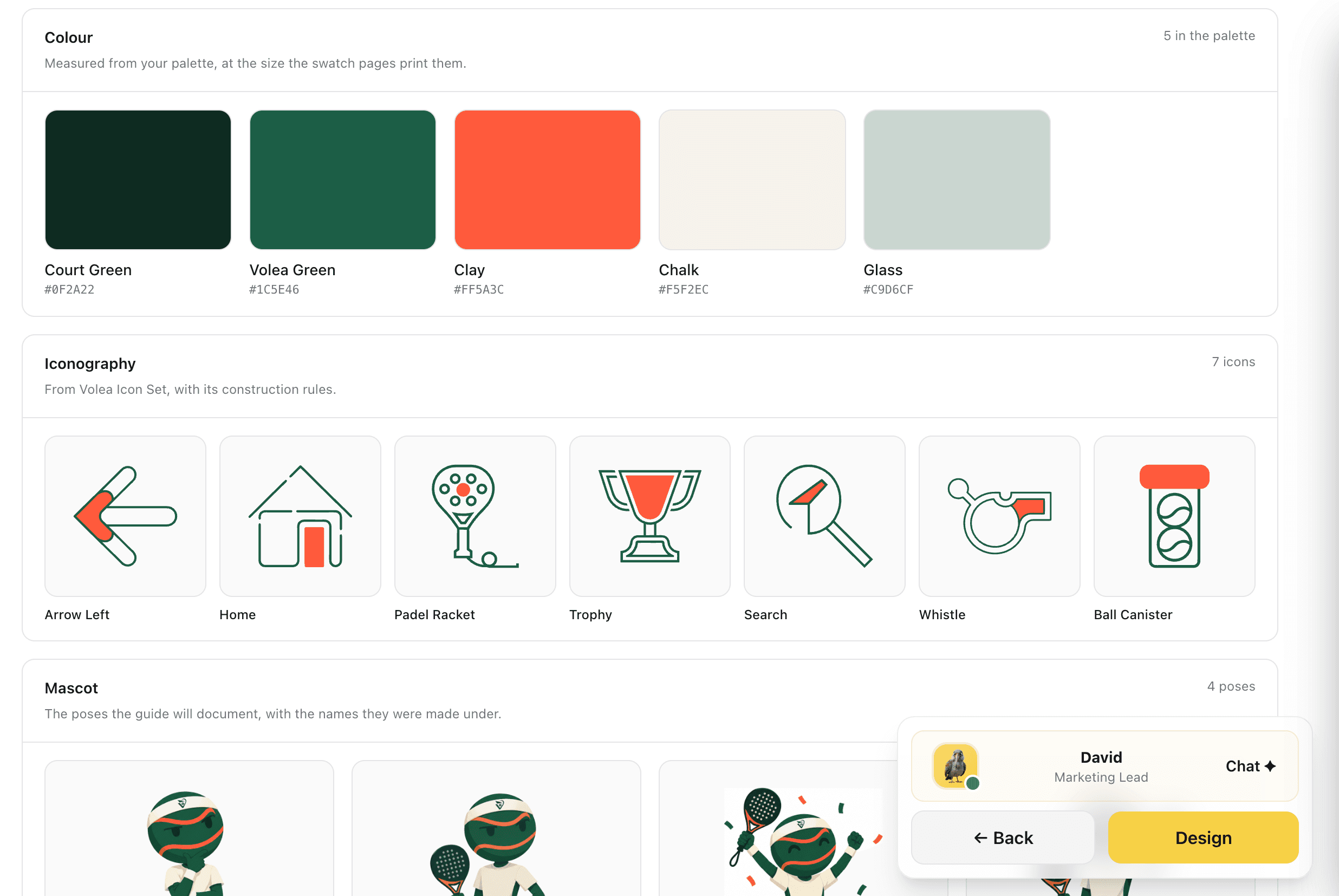
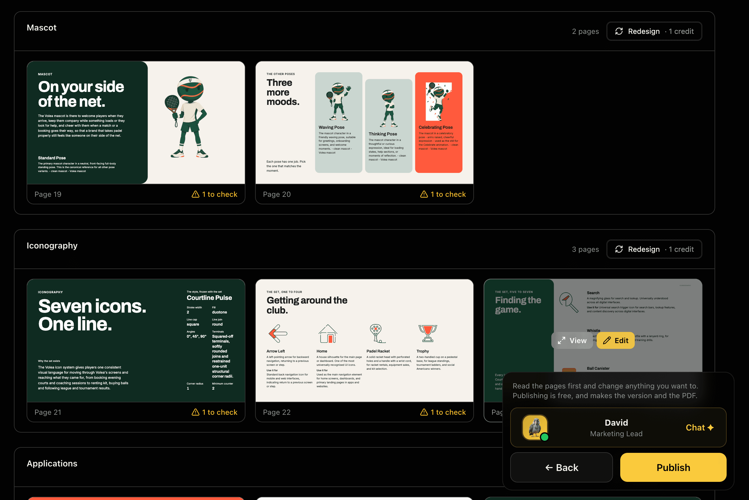
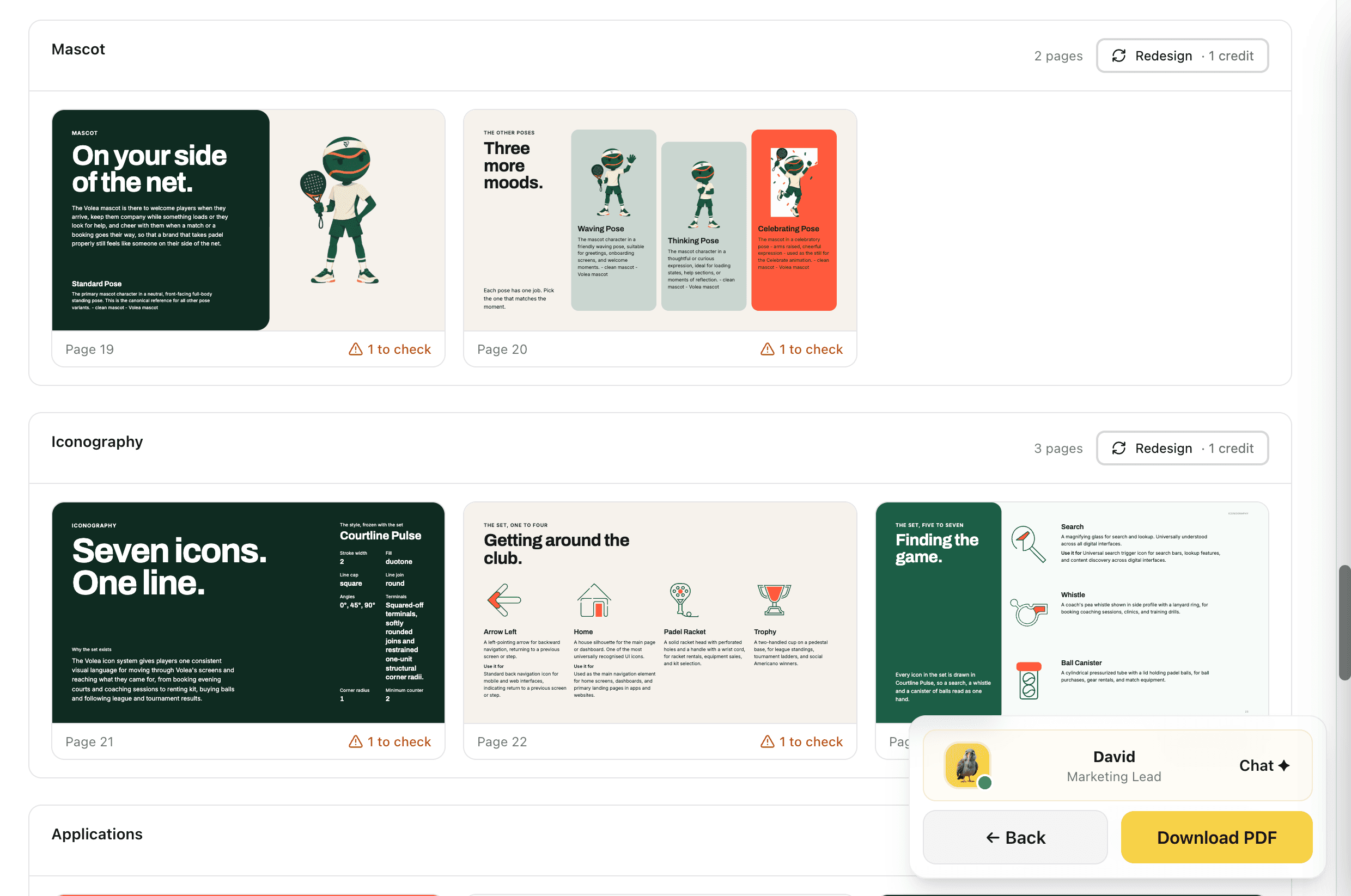
The palette is read from your brand with every colour named and its hex alongside, shown at the size the swatch pages print them. Iconography comes from a finished icon set, carrying its construction rules with it. Mascot poses arrive from your Asset Library under the names they were made with. None of it is typed in for the guide.
Every section is counted before it is drawn: five colours, seven icons, four poses. The guide documents what you have, not what a template expects.
Captures
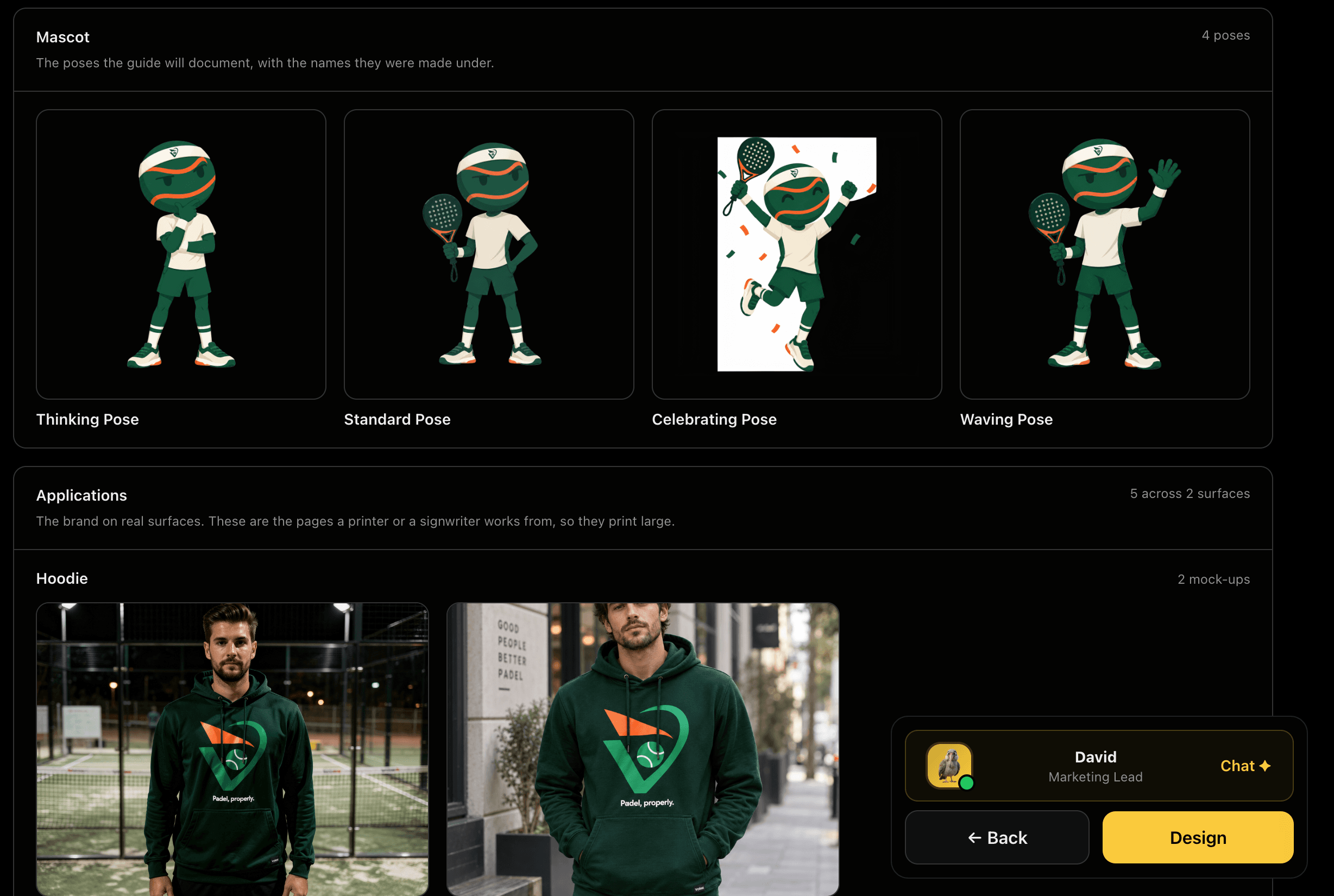
The Brand on Real Surfaces
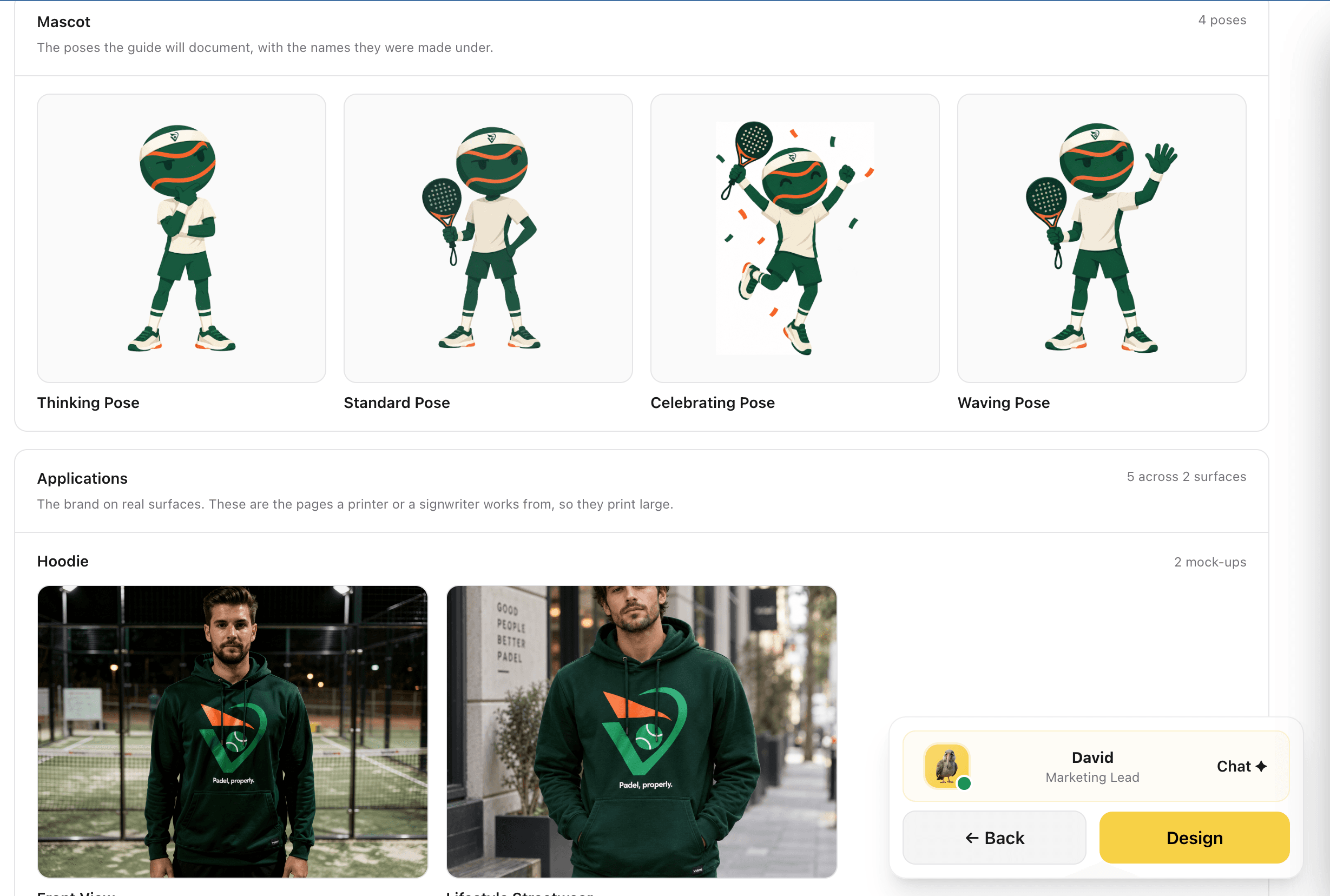
Mascot poses are listed with the names they were made under, so a page can say which one to reach for. Applications pull real mock-ups from your brand, grouped by surface: the apparel a printer works from, the scenes a signwriter works from. These are the pages that get printed large, so they are built from the highest-quality source you have.
A guideline that only shows a logo on white never answers the question people actually have, which is what it looks like on the thing they are making.
Captures
Channels and Type in Their Own Faces
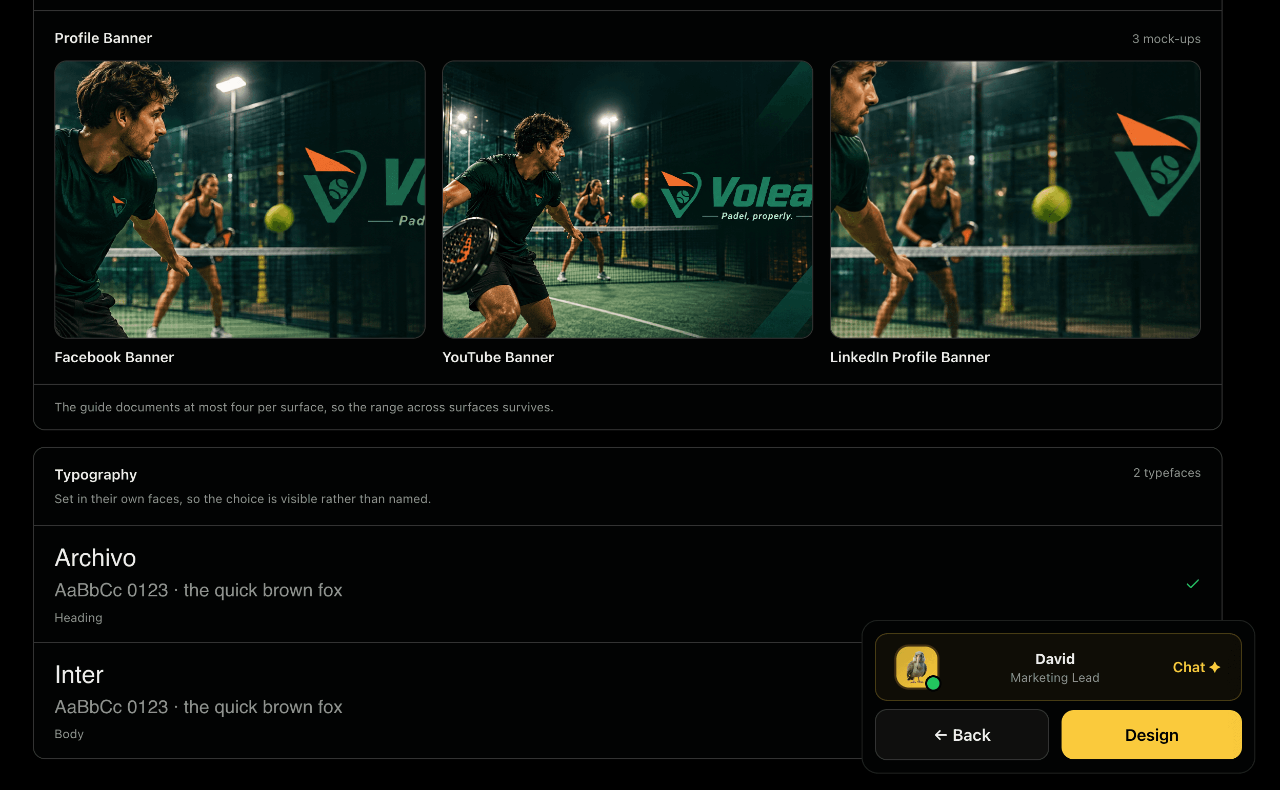
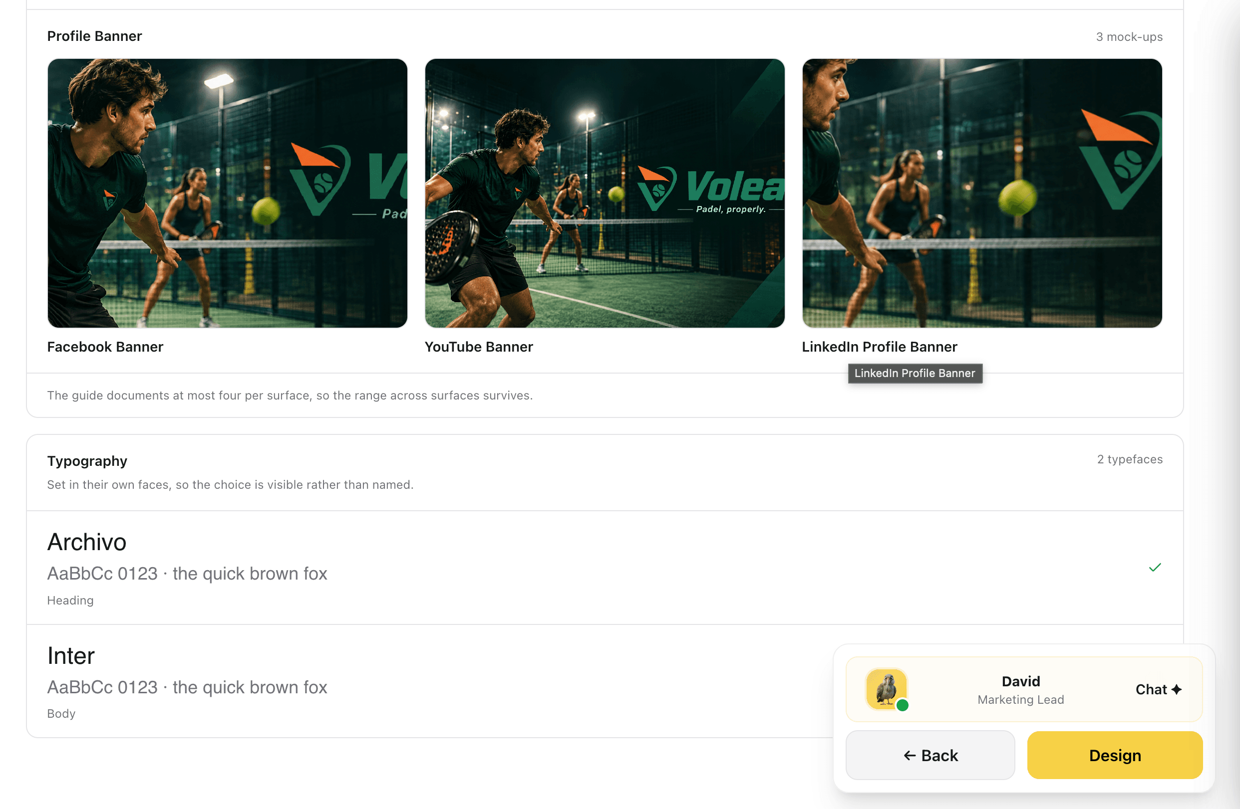
Profile banners are documented per channel, at most four per surface so the range survives without the section turning into a catalogue. Typefaces are set in themselves rather than named in a caption, with the heading face and the body face shown side by side, so the choice is visible at a glance.
Naming a typeface tells a reader nothing. Setting it in its own face answers the question in one line.
Captures
Review, Fix and Redesign by Section
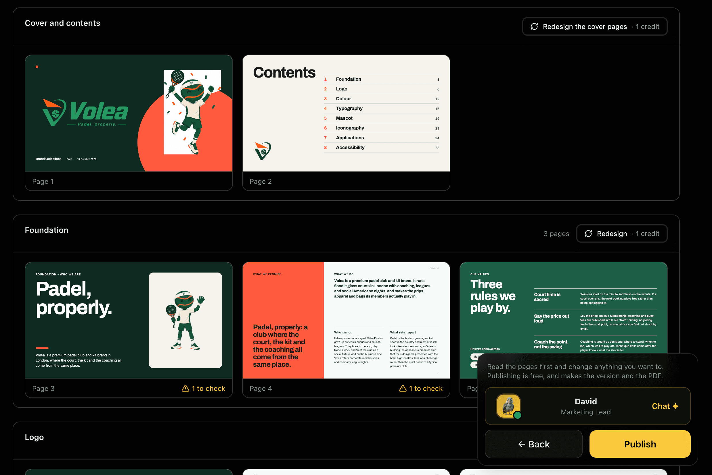
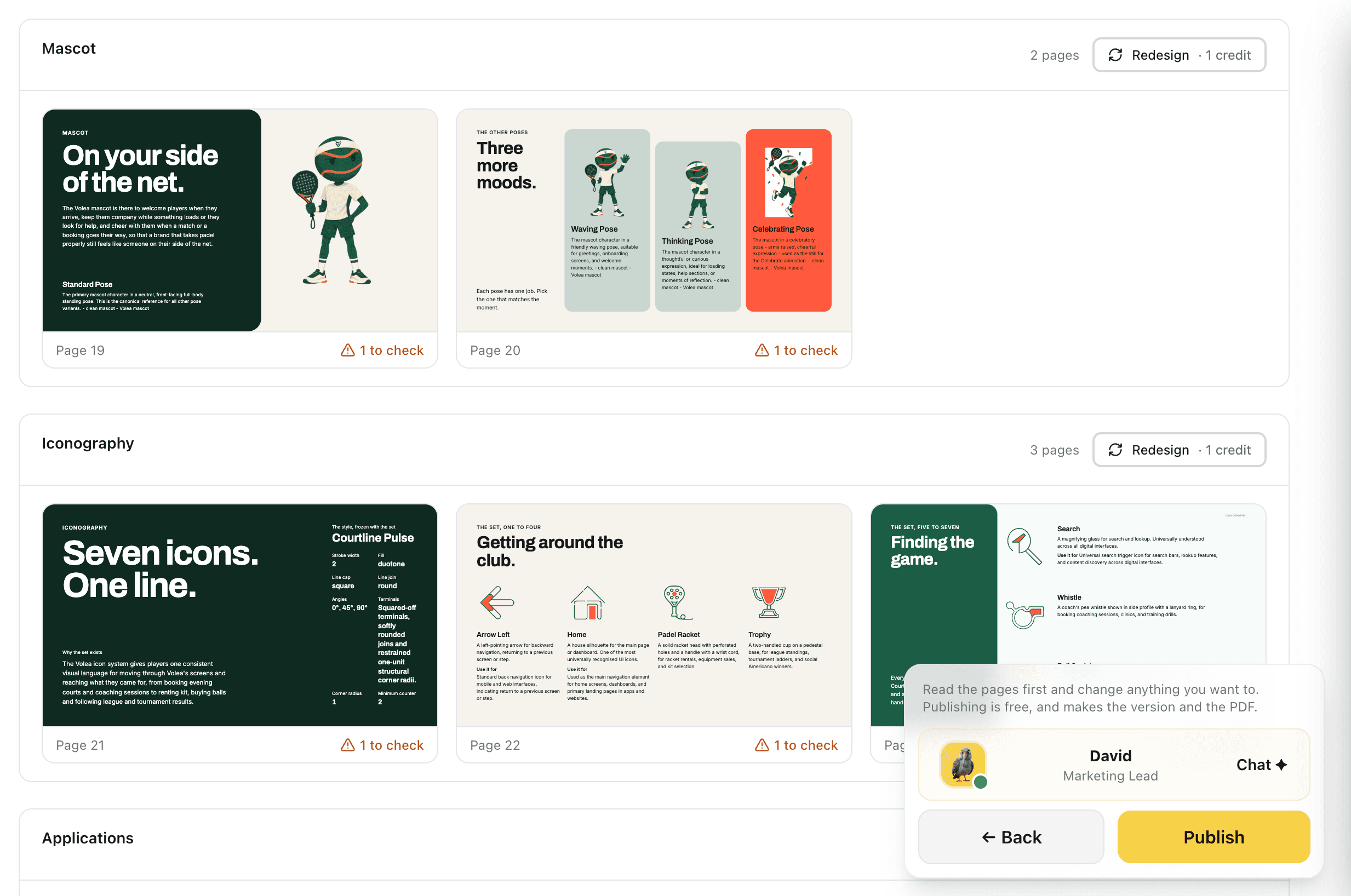
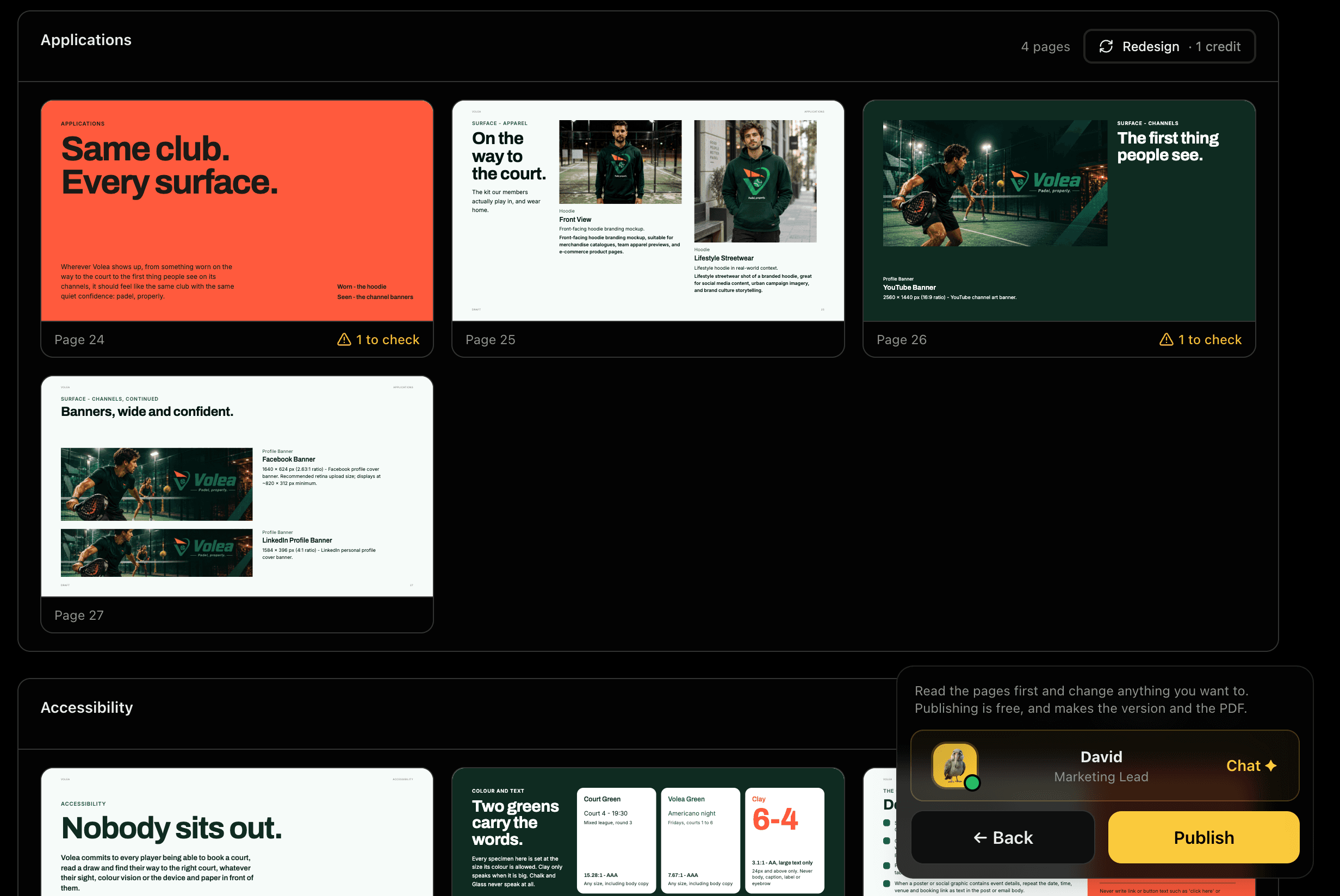
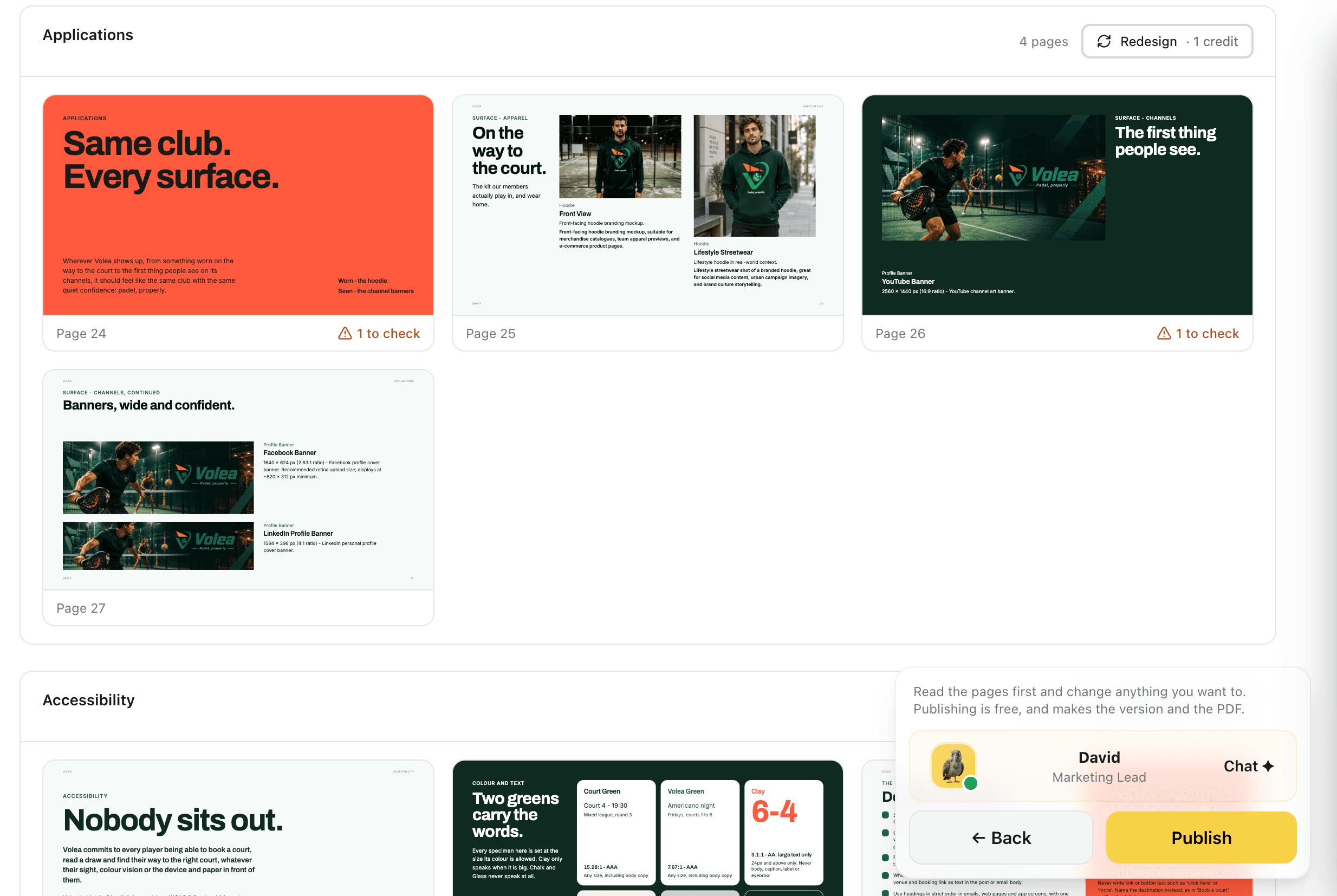
Every designed page at full size, grouped by section with its page numbers. Layout checks are written as plain sentences about the page, flagged as something to check rather than a silent failure. Redesign any single section for one credit instead of redrawing the document, and read the whole thing before you publish, because publishing is free.
You can correct one section without touching the rest, and nothing is spent until you ask for it.
Captures
Clear Space and Minimum Size, Measured
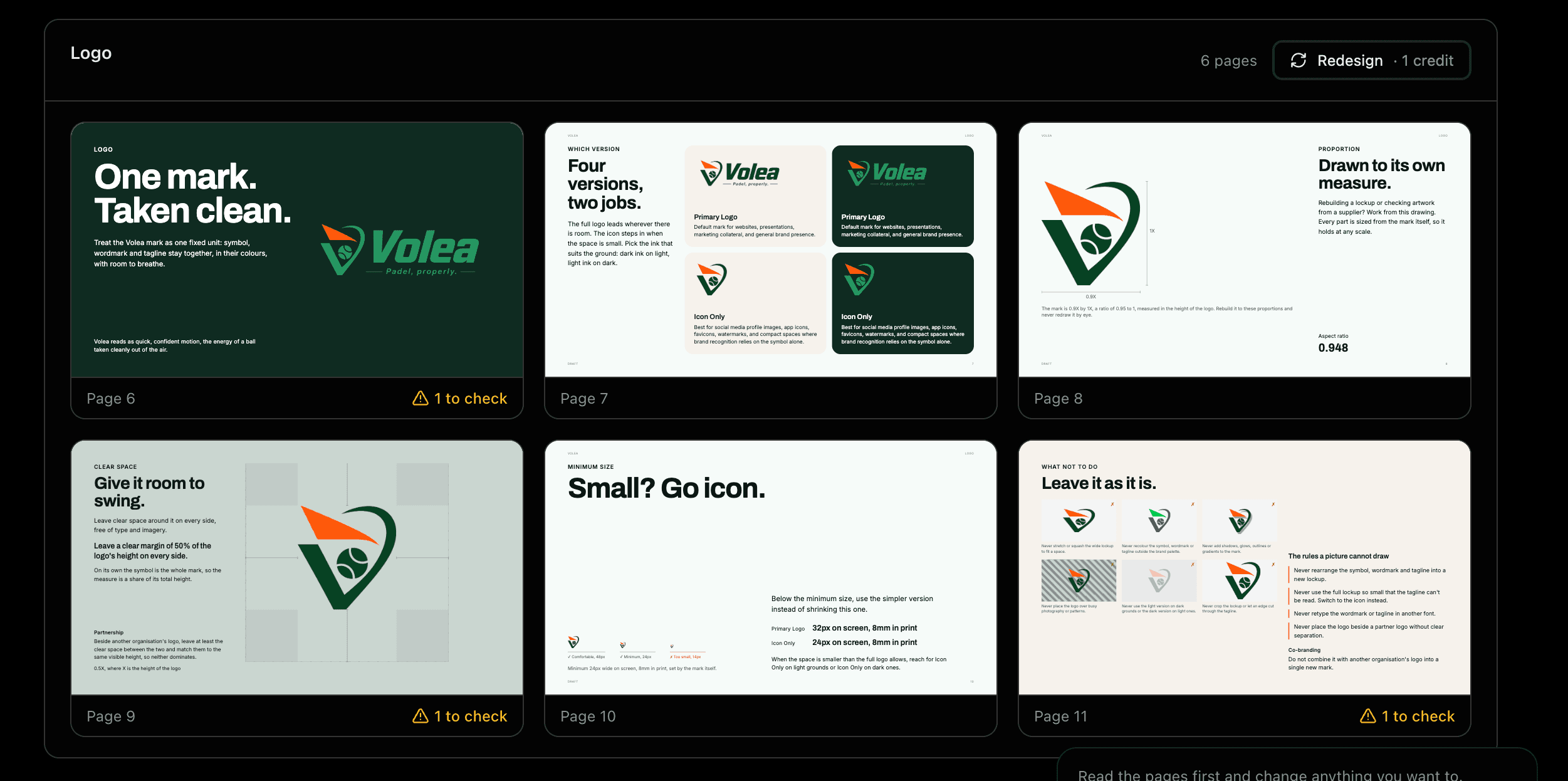
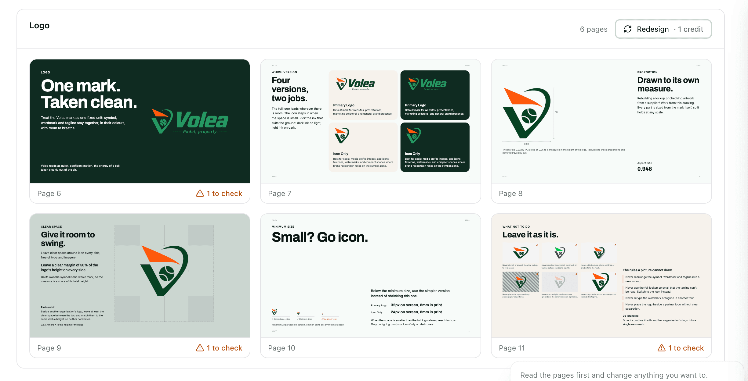
The logo section answers the questions people actually ask: which version to use and when, the proportion the mark is built on, how much room to leave around it, the size below which you switch to the icon, and what not to do. The clear space margin and the aspect ratio are measured from the artwork itself, and the minimum sizes are given on screen and in print.
Colour, With the Proportions Named
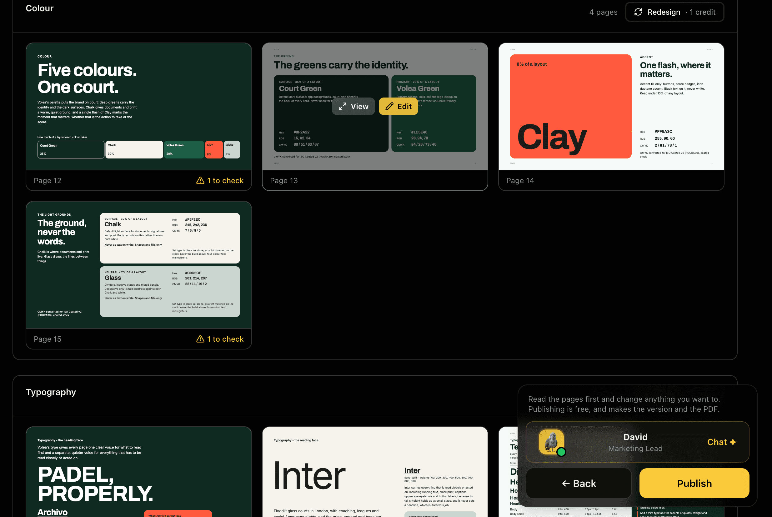
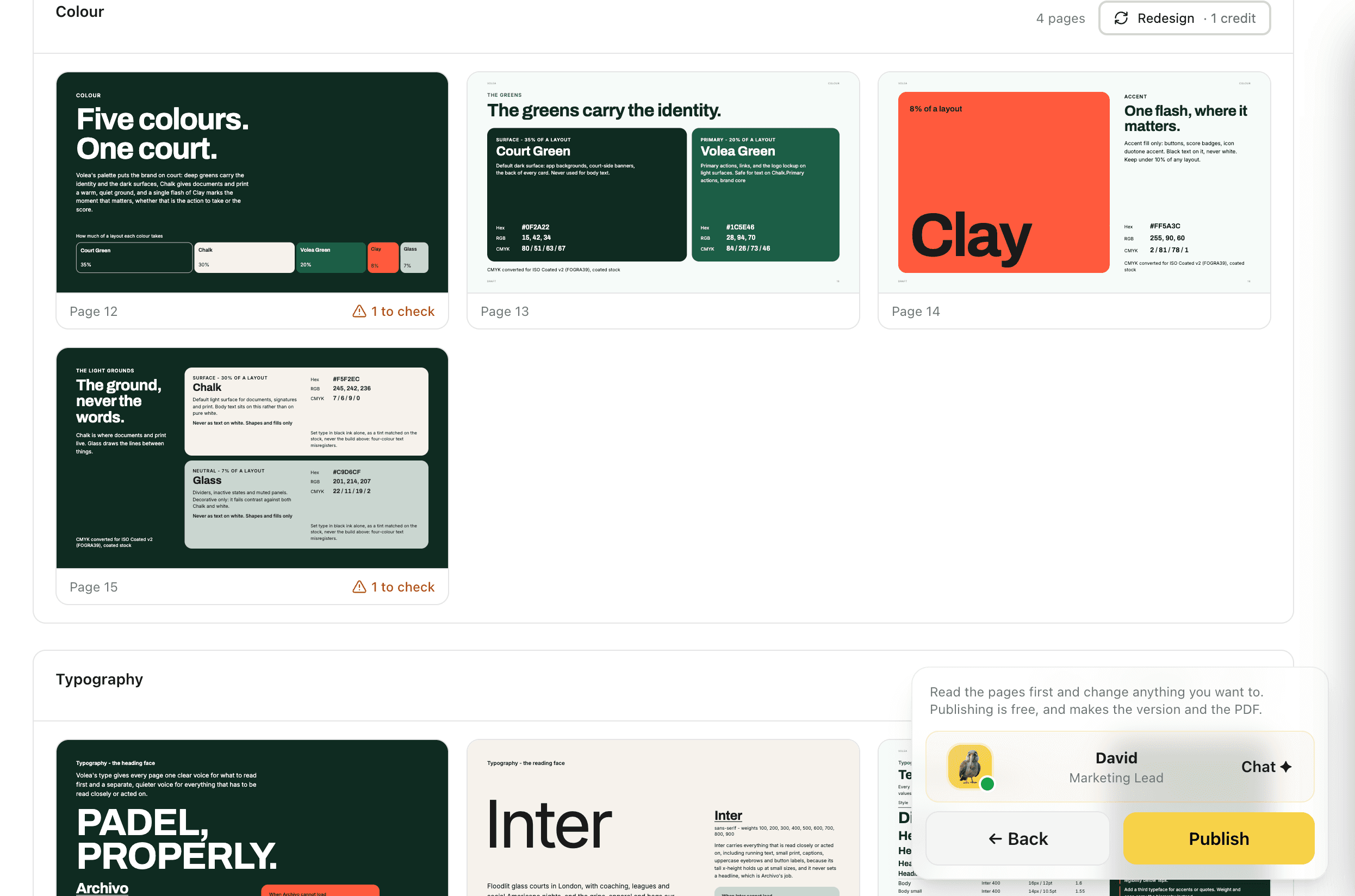
Each colour gets a page that says what it is for and how much of a layout it should occupy, with hex, RGB, CMYK and the stock the CMYK was converted for. The accent page states the rule in the words a designer needs, down to which colour to set type in on top of it and what never to do with it.
Surfaces and Accessibility, on the Page
The applications pages carry the brand across every surface it shows up on, with the real mock-ups and the exact pixel dimensions a channel asks for. The accessibility section states the contrast ratio of each colour pairing against the standard it meets, so a reader can check a combination instead of guessing at it.
Publish and Download the PDF
Publishing is free and is what creates the version and the PDF. Designing does not publish by itself, so you read the pages and change what you want first. Download the PDF at 1920 by 1080. Every published version can be compared against the current one or restored.