

Generate a family of icons as real vectors, not pictures of icons.
Icon Sets produce SVG, so the same icon works at 16 pixels in a menu and two metres on a trade-show banner. Generating a set together gives every icon the same weight, corners and level of detail, which is what icons generated one at a time never hold on to.
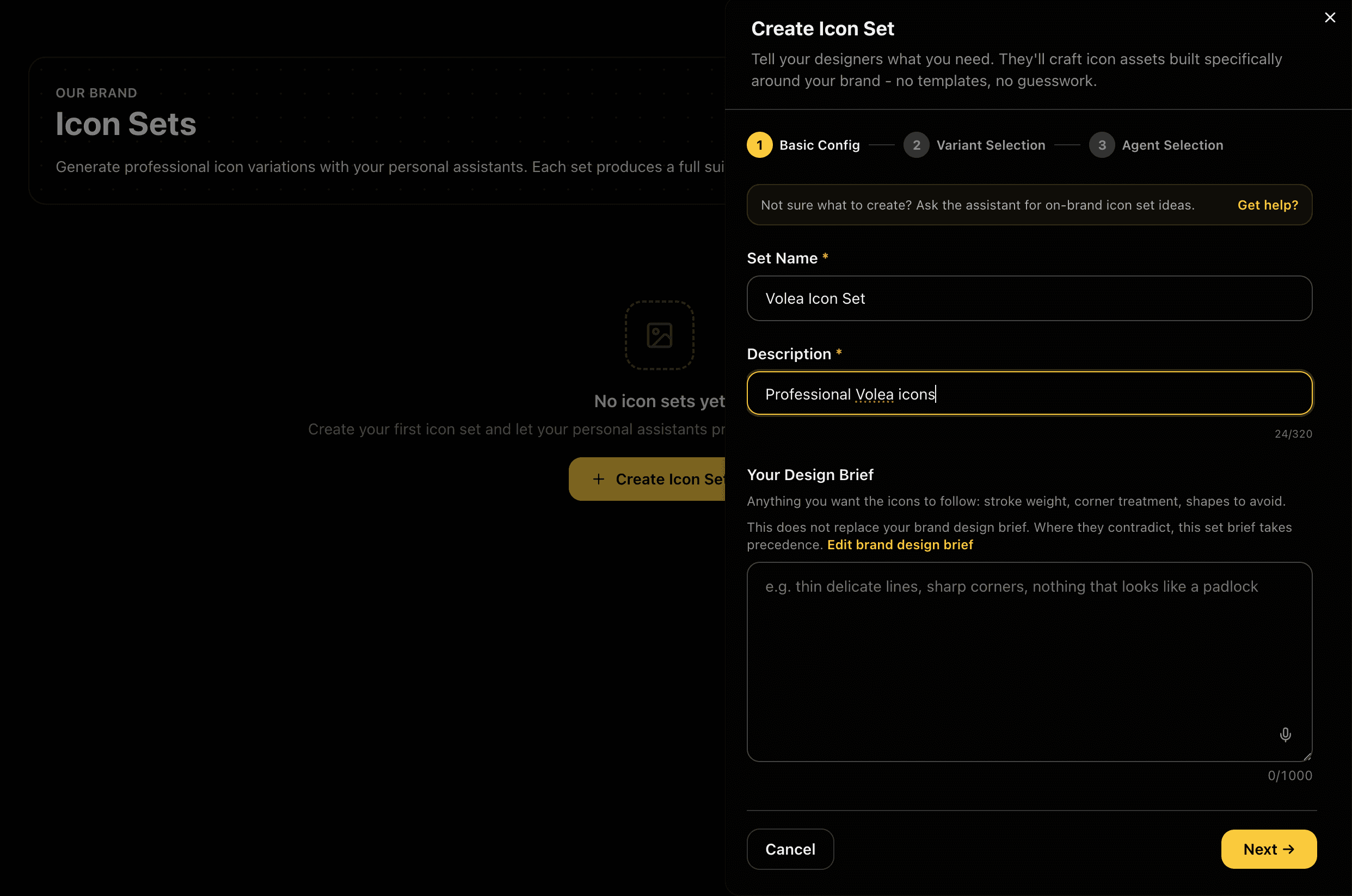
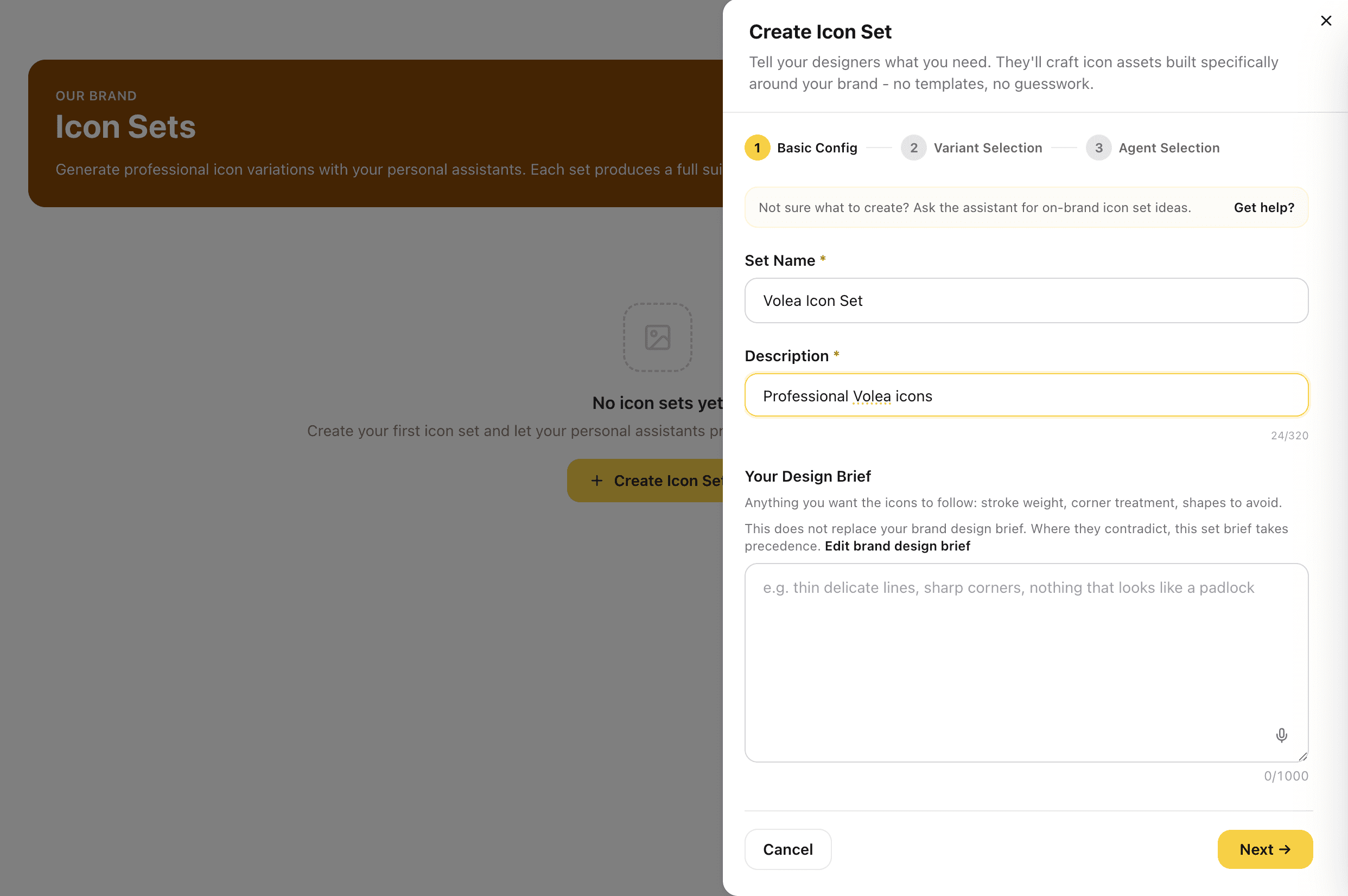
Name the Set and Brief the Designers
Give the set a name and a short description, then add a design brief if you have one: stroke weight, corner treatment, shapes to avoid. The brief is optional, and anything you leave out is drawn from your brand instead. A set brief sits on top of your brand design brief, so where the two disagree, the set brief wins.
The brief is where a specialist business stops getting a generic UI icon pack. Say what the icons must avoid and it applies to every icon in the set.
Captures
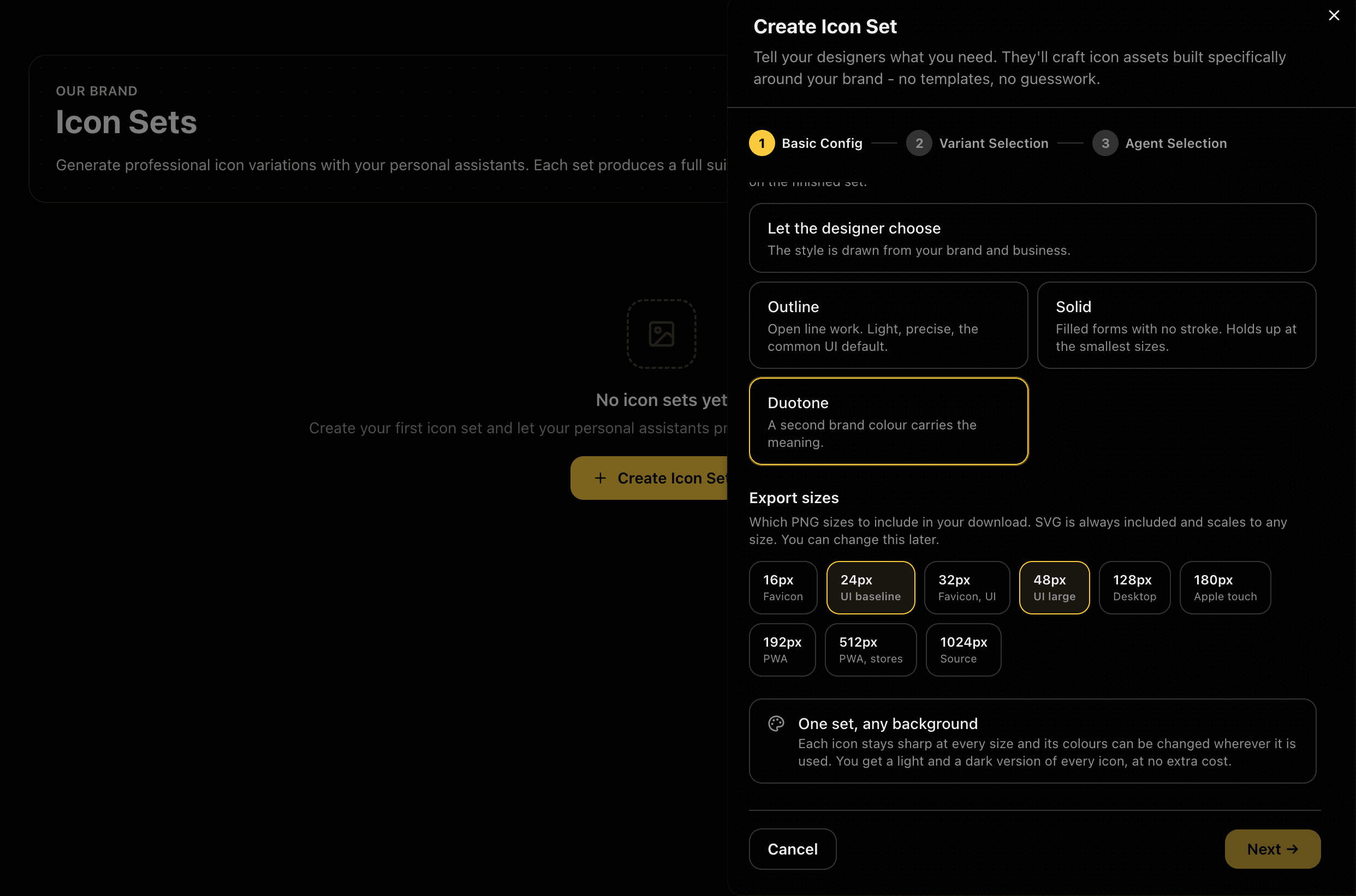
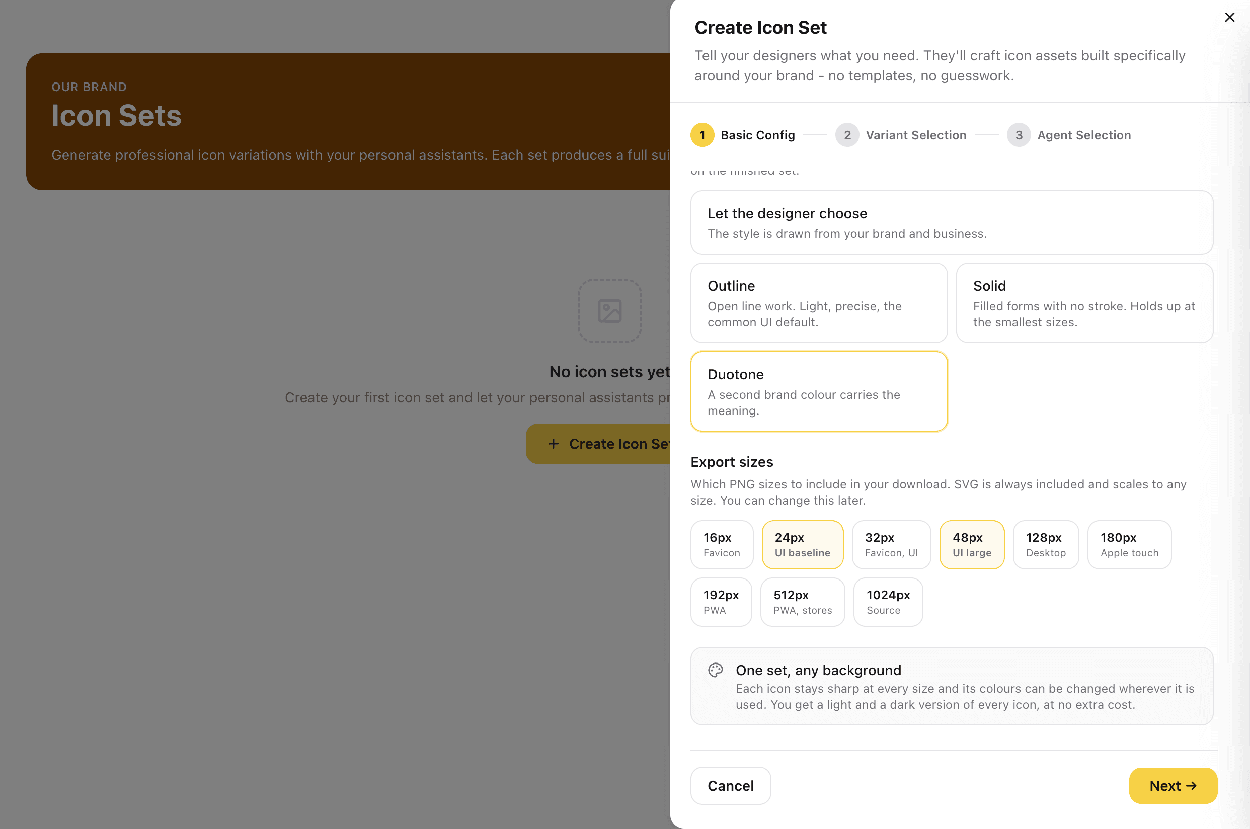
Set the Style and the Export Sizes
Pick the treatment the whole set is drawn in: Outline for open line work, the common UI default. Solid for filled forms with no stroke, which hold up at the smallest sizes. Duotone, where a second brand colour carries the meaning. Not sure? Let the designer choose, and the style is drawn from your brand and your business instead. Then tick the PNG sizes you want, each labelled with the job it does.
The treatment is a set-wide decision, not a per-icon one. Choosing it once is what makes a set look like one family.
Captures
Pick From the Contact Sheets
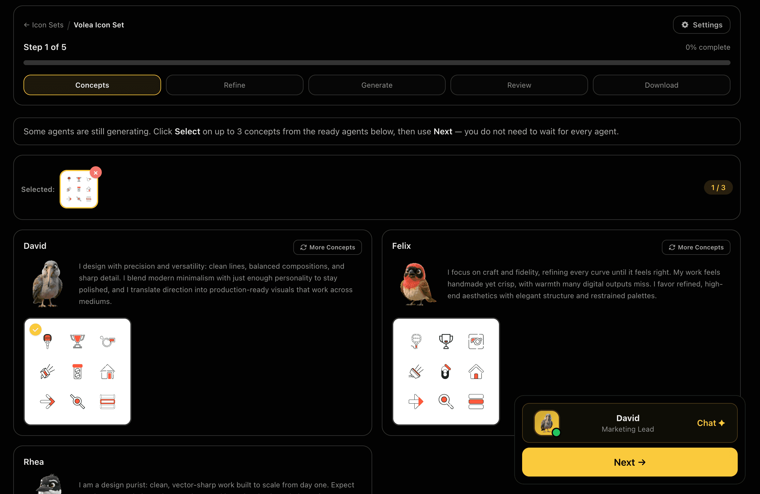
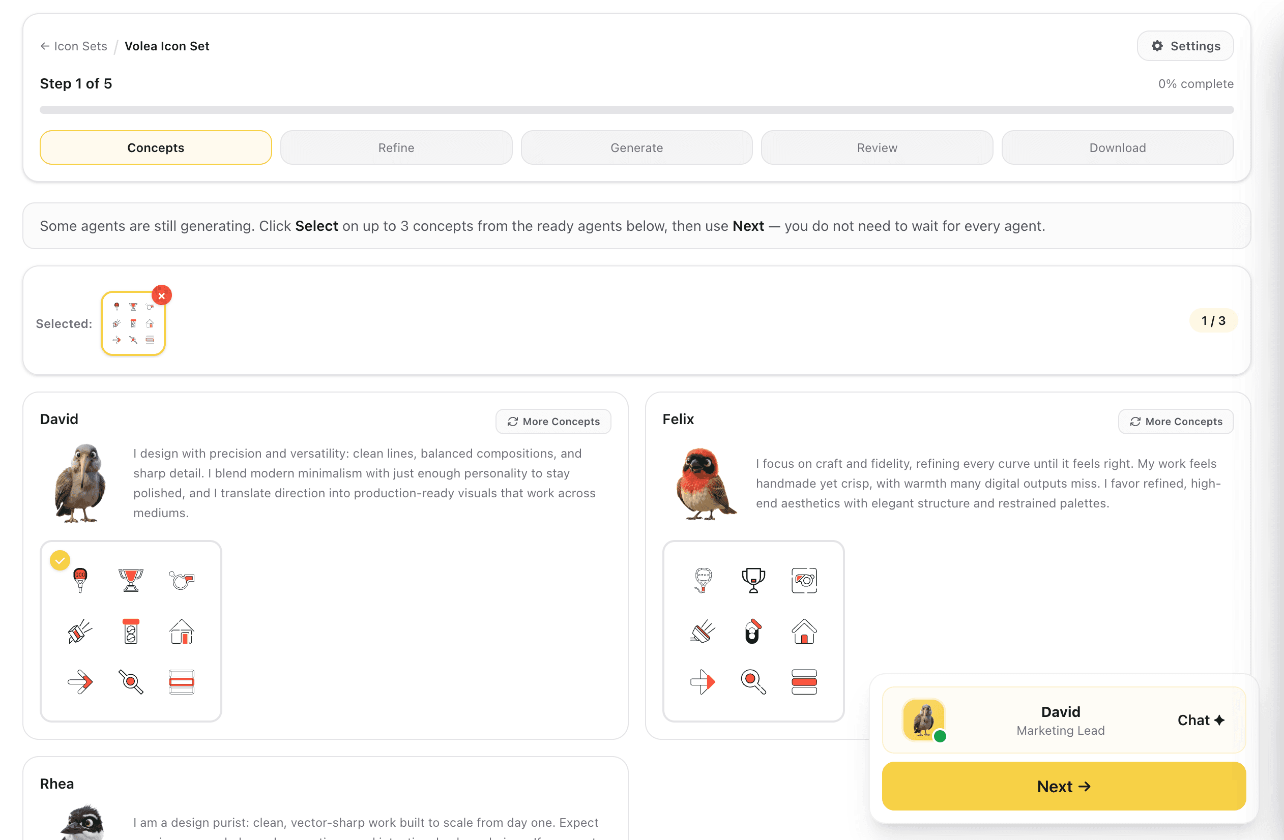
Each designer proposes a style direction as a contact sheet of nine icons rather than a single image, so you are judging a family and not one lucky result. Take up to three sheets forward, and start as soon as the first designers are ready instead of waiting for all of them.
Nine icons per sheet is enough to see whether a direction holds together across easy shapes and awkward ones alike. This is the decision everything else inherits.
Captures
Choose a Base and Refine It
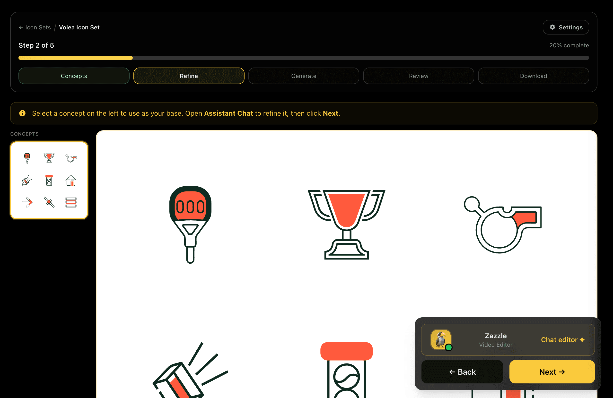
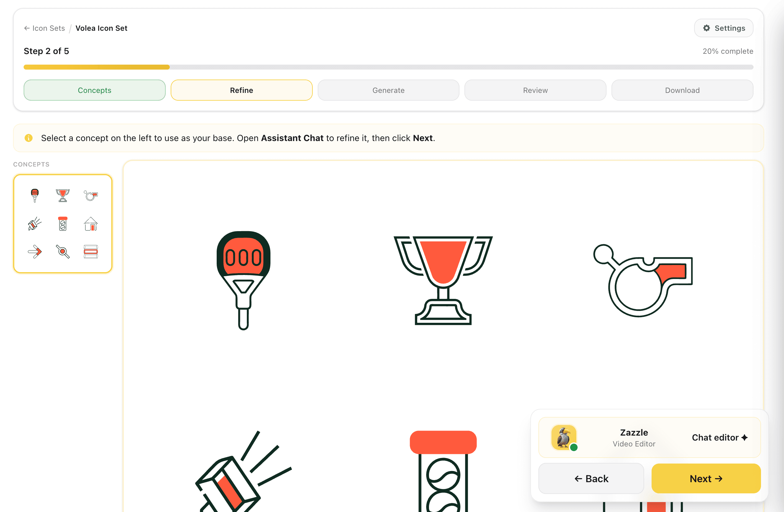
Set one contact sheet as your base, see its icons drawn large, and refine the direction in Assistant Chat. The sheets you did not pick stay in the rail, so changing your mind costs nothing.
Judging nine icons at full size catches the ones that only worked as thumbnails.
Captures
Recolour Free, and Check It at 16px
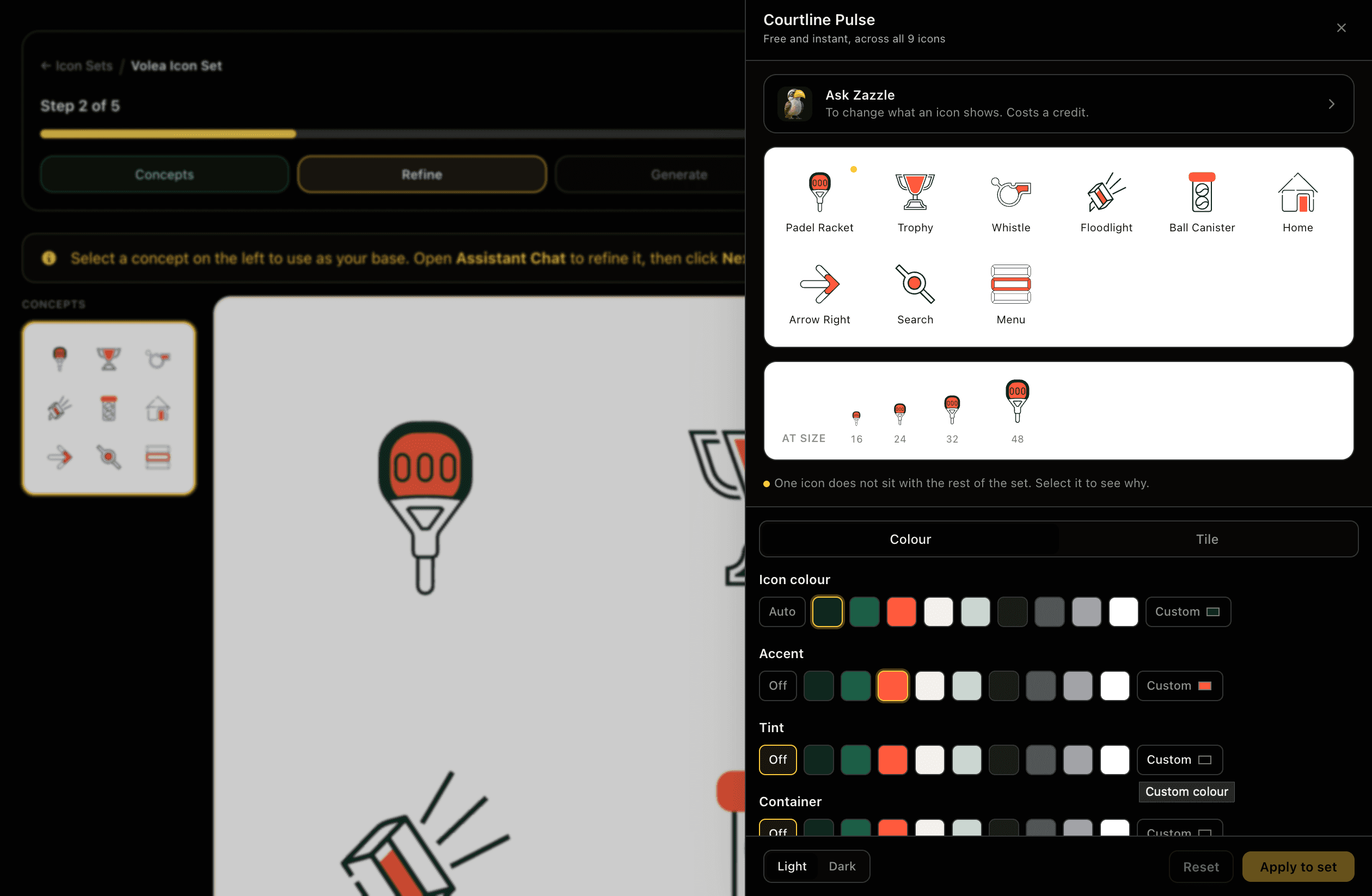
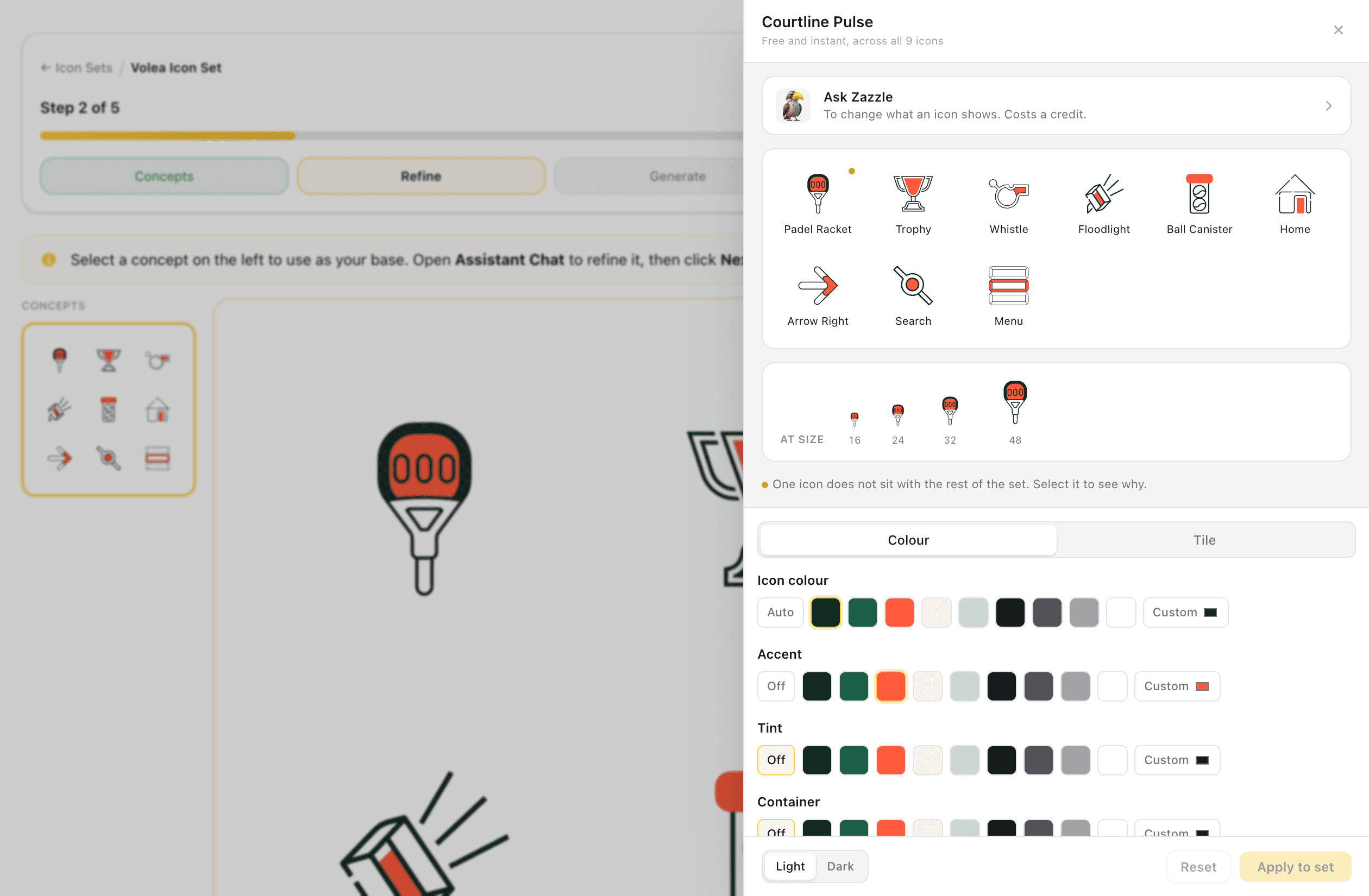
Open any icon to recolour it across the whole set: icon colour, accent, tint and container, from your brand palette or a custom value, with separate light and dark results. Colour changes are free and instant because the icons are vectors. Only changing what an icon shows costs a credit. The same panel previews the icon at 16, 24, 32 and 48 px, and flags any icon that does not sit with the rest of the set.
The two things that normally mean regenerating a set, a colour change and an icon that does not read at small size, are a preview and a toggle here instead.
Captures
Generate the Set, Fix What Missed
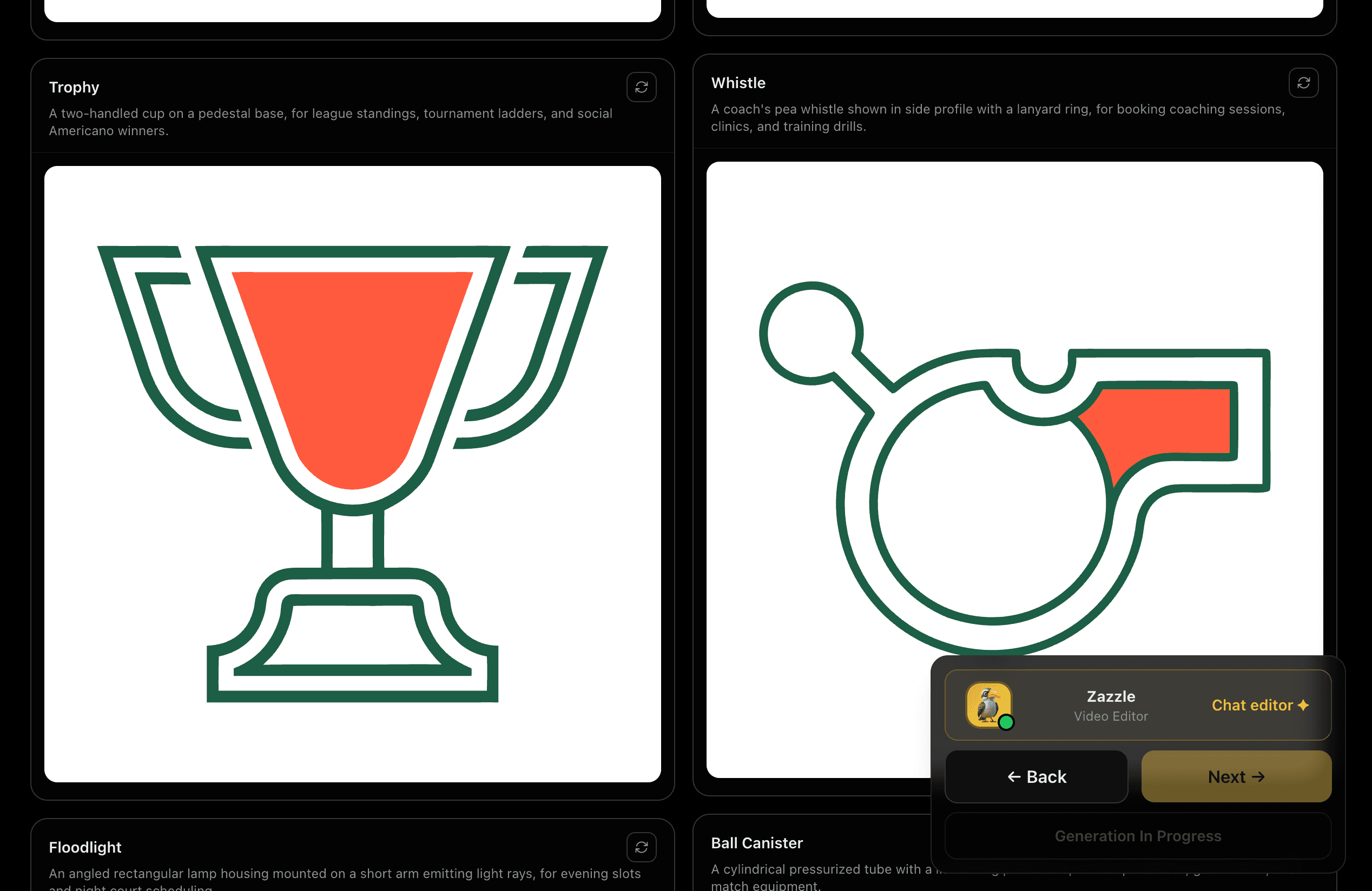
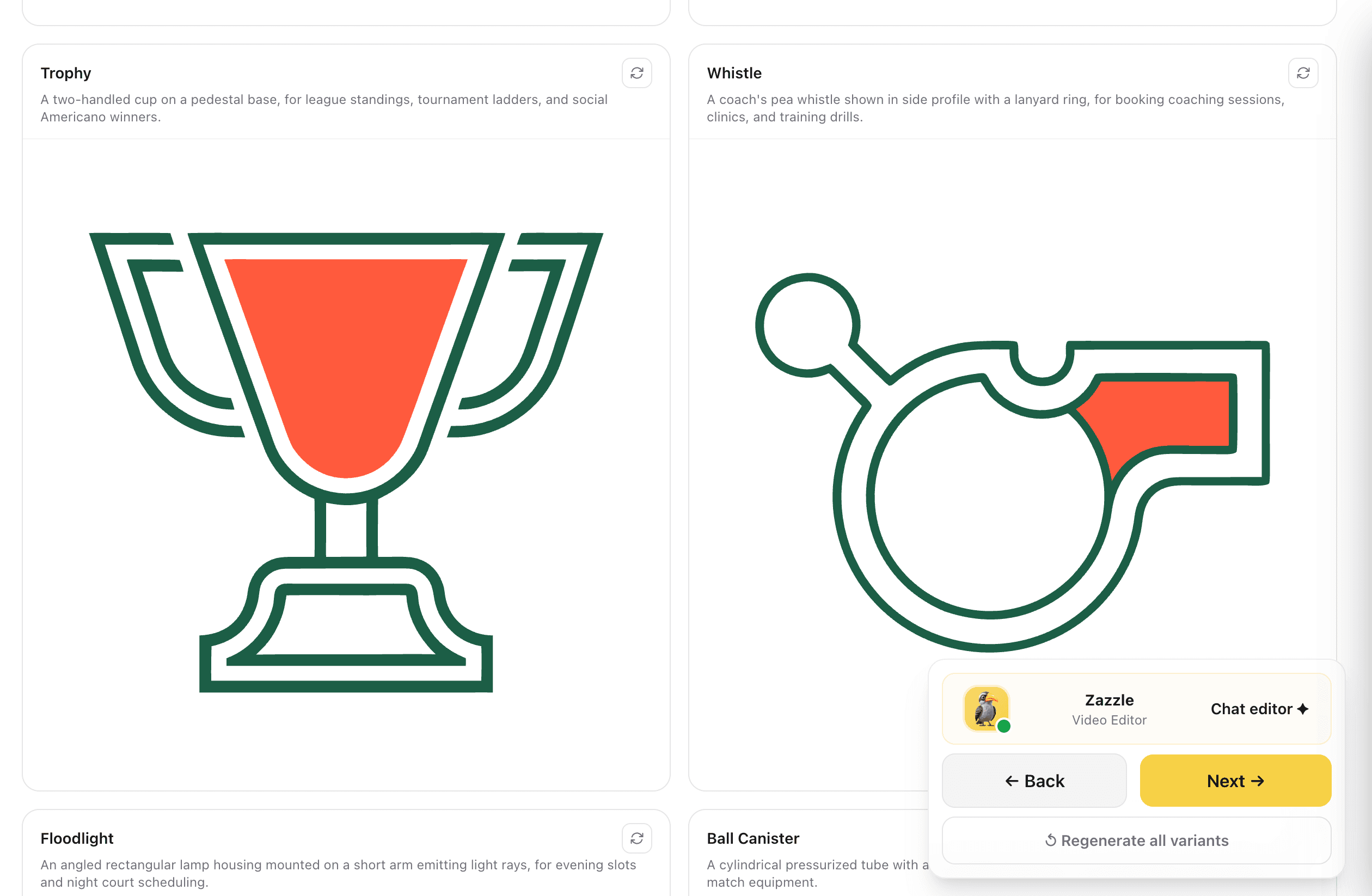
The full set is produced at size, each icon captioned with what it shows and what it is for. Regenerate a single icon that did not land, or the whole set if the direction needs another pass. If one icon is unrecognisable, try a more concrete name: small canvases punish complicated subjects.
Fixing one icon costs one icon, not the set.
Captures
See the Whole Set Together
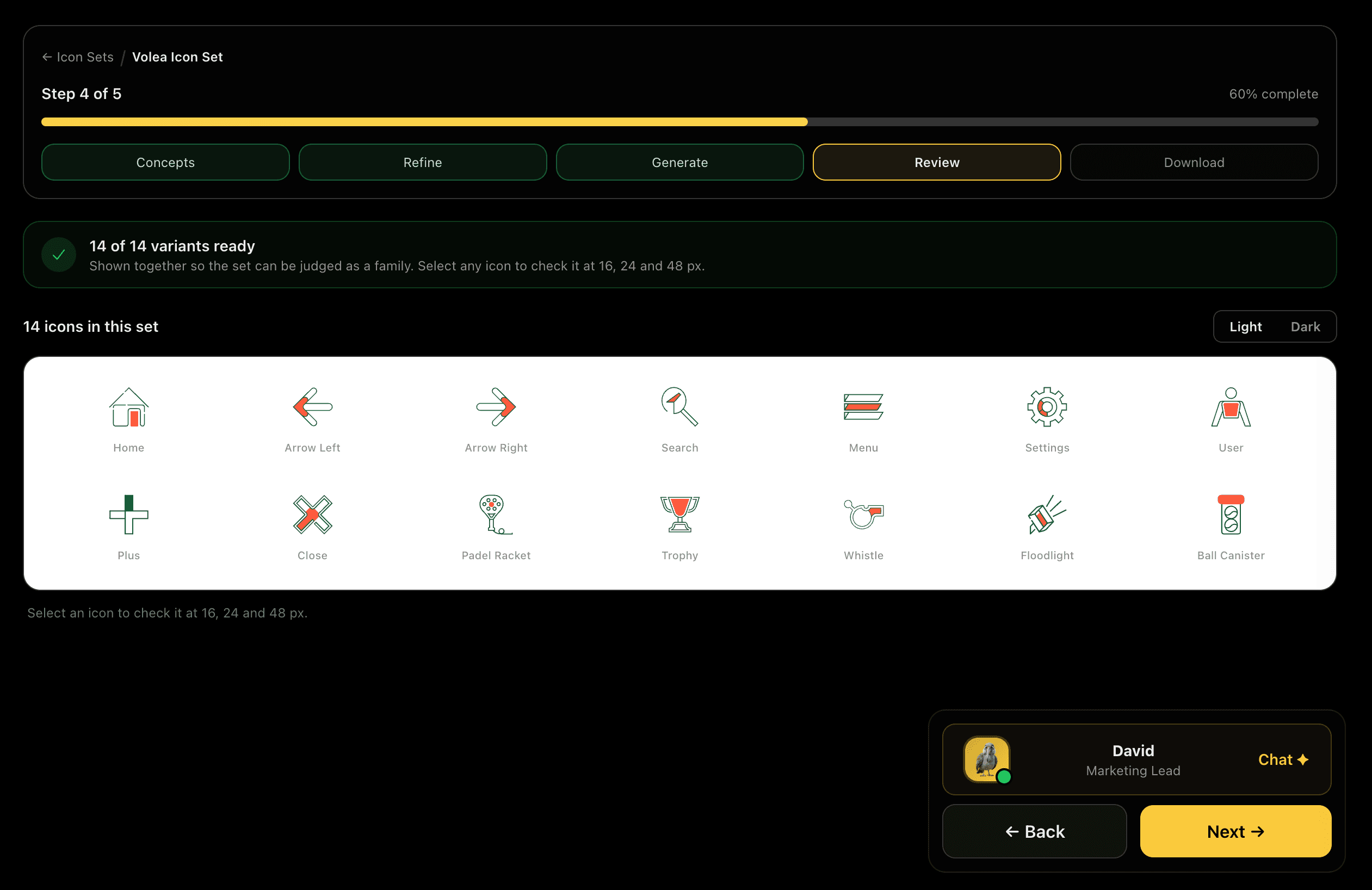
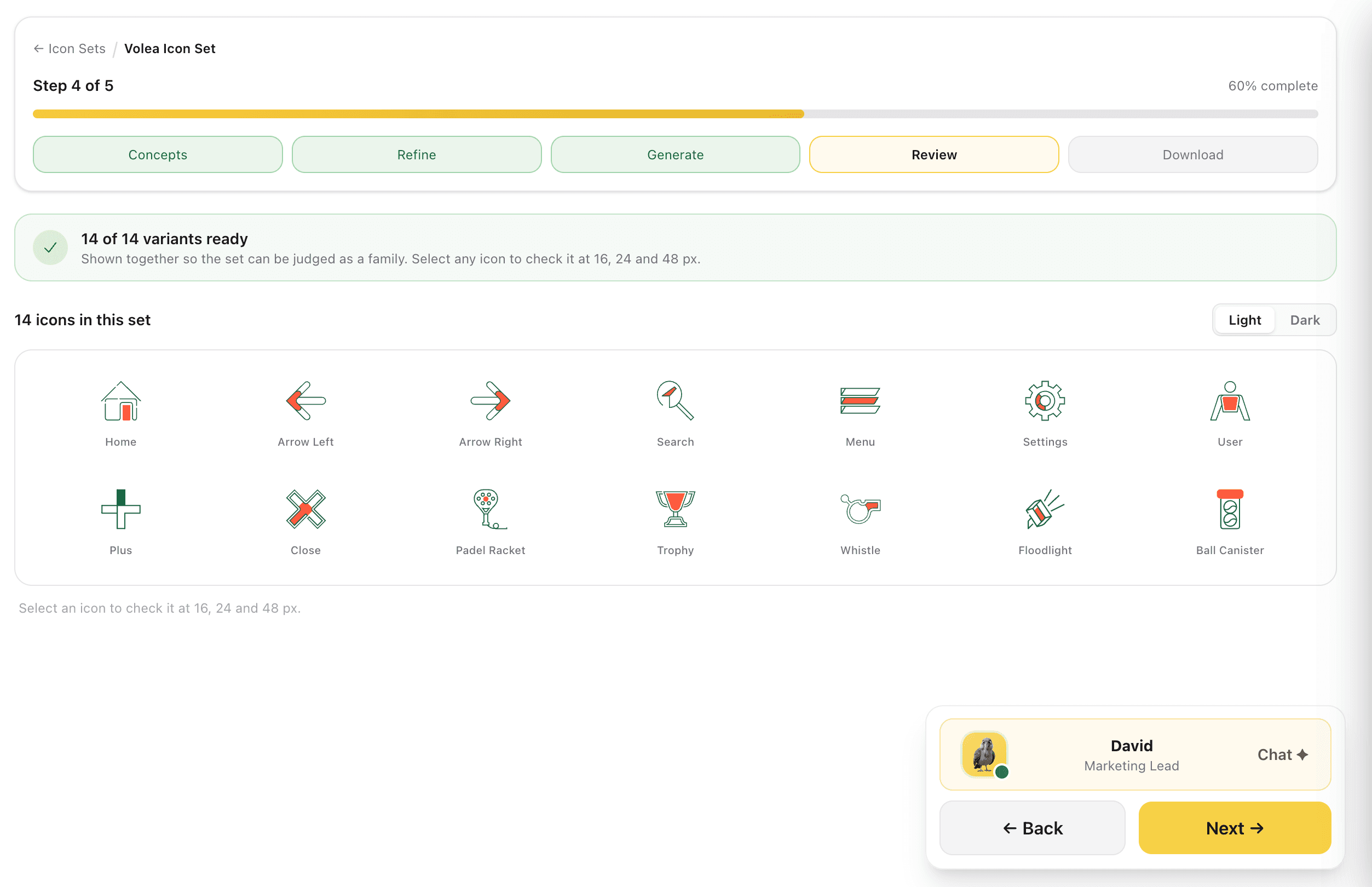
Every variant is shown in one grid so the set can be judged as a family, with a light and dark toggle over the lot. Standard icons like home, search and settings sit beside the ones specific to your business, drawn in the same hand.
Drift between icons is only visible side by side. This is the view that catches it before you download.
Captures
Download SVG and PNG, Both Themes
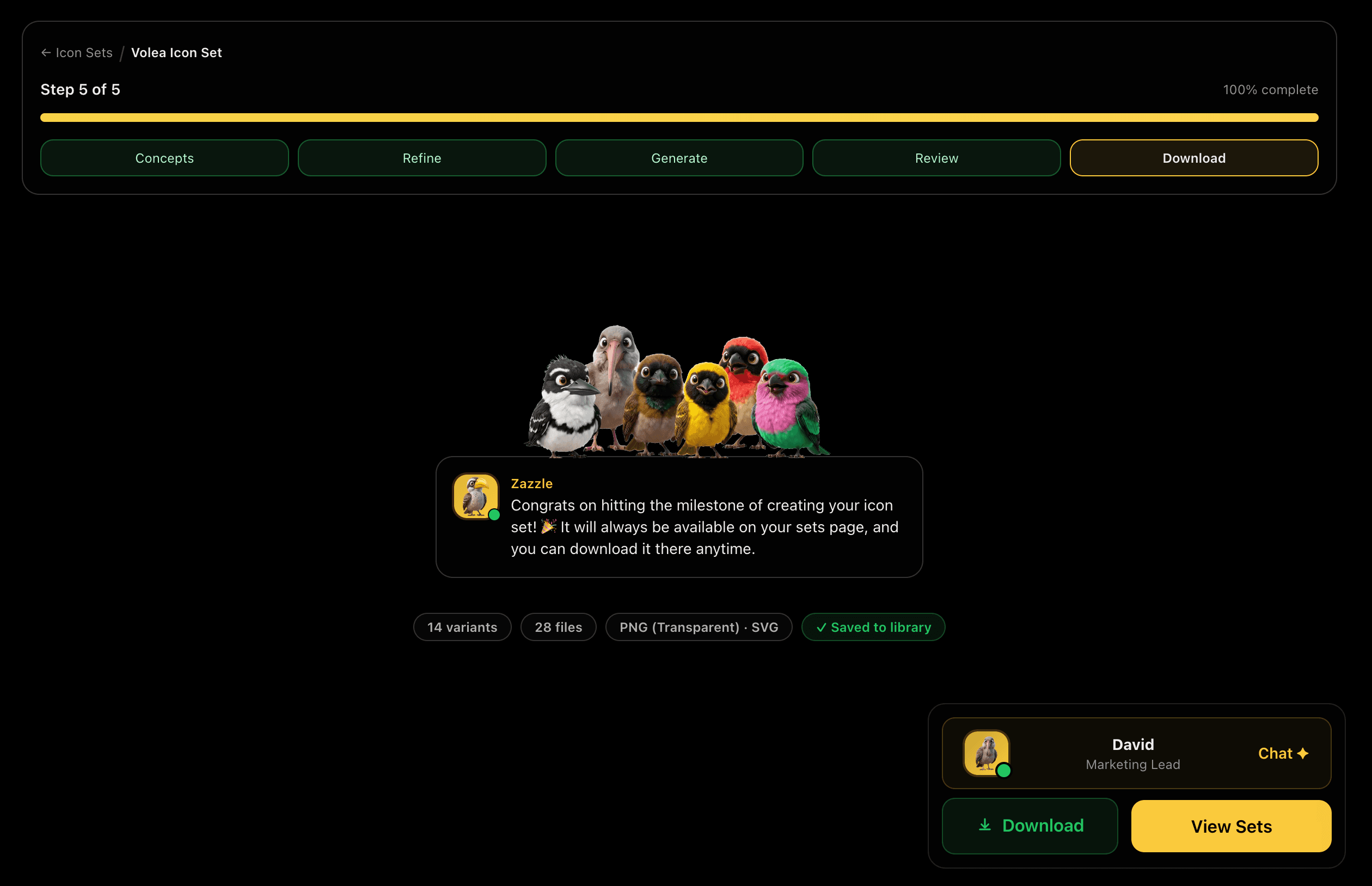
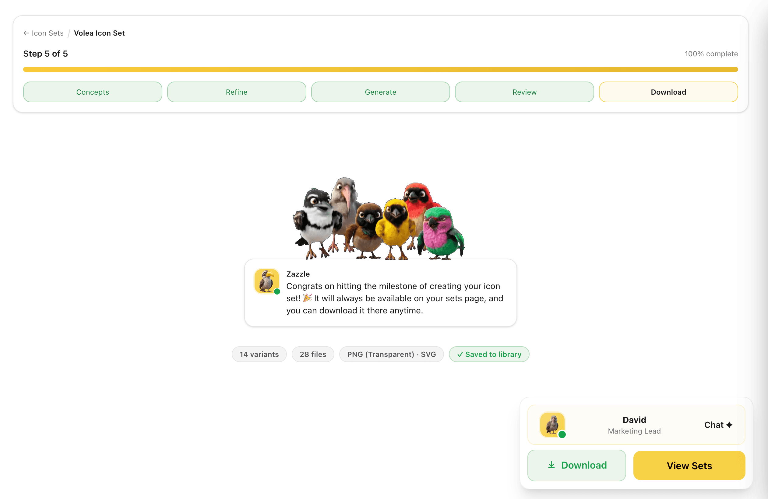
Download gives you the SVGs plus PNGs at the export sizes you picked, each one labelled with what it is for: 16 and 32 for a favicon, 24 and 48 for UI, 128 for desktop, 180 for the Apple touch icon, 192 and 512 for PWAs and app stores. Every icon arrives in a light and a dark version at no extra cost, and the set is saved to your library at the same time.
The sizes are named after the job rather than left for you to work out, and the dark versions are already there instead of being a second project.
Captures
Your Icons on Cards and Signatures
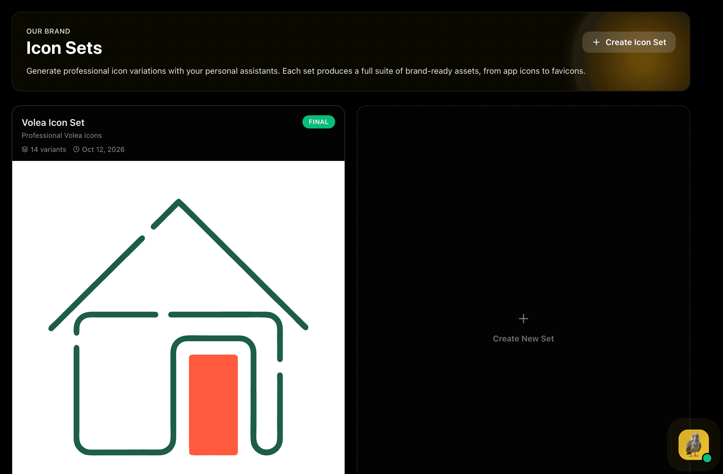
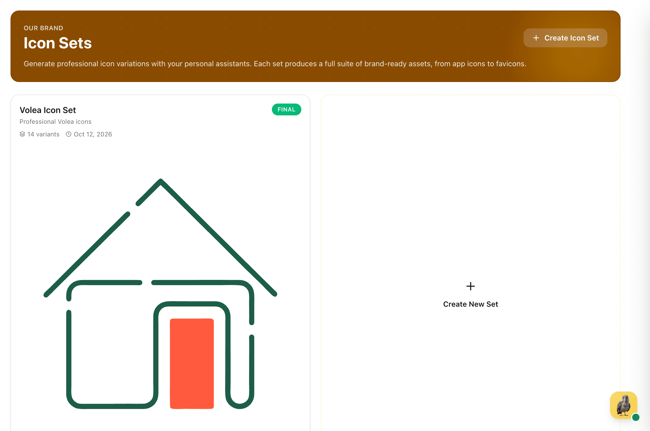
Finished sets stay on your Icon Sets page, ready to reuse. When a business card or email signature is generated, the design assistant looks through them: if one set has an icon for every contact detail the design shows, it places your own icons beside those details. It is all or nothing, because a set with a phone icon but no email icon would mix yours with generic ones and look like a mistake.